Product design
TripSource
Making business travel easier to book, across mobile and desktop.
01 / 09
A booking experience built around the traveller
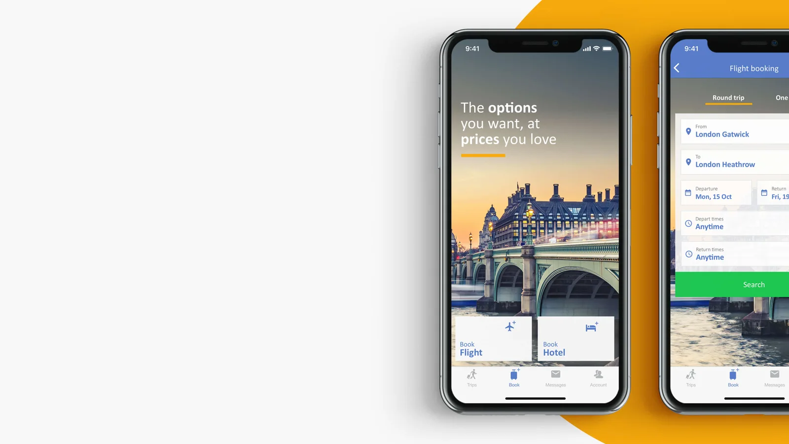
TripSource helped business travellers manage their journeys. Air Booking introduced a new challenge: giving travellers a self-service way to book flights while helping their companies manage cost and travel policy. Business trips are often booked close to departure, under time pressure, with personal preferences and company rules competing for attention.
The goal was to simplify the core interactions, improve navigation and make booking feel consistent across the website, iOS and Android. The product needed to support the traveller’s decisions without hiding the information that made a booking appropriate for their company.
02 / 09
My role and the team
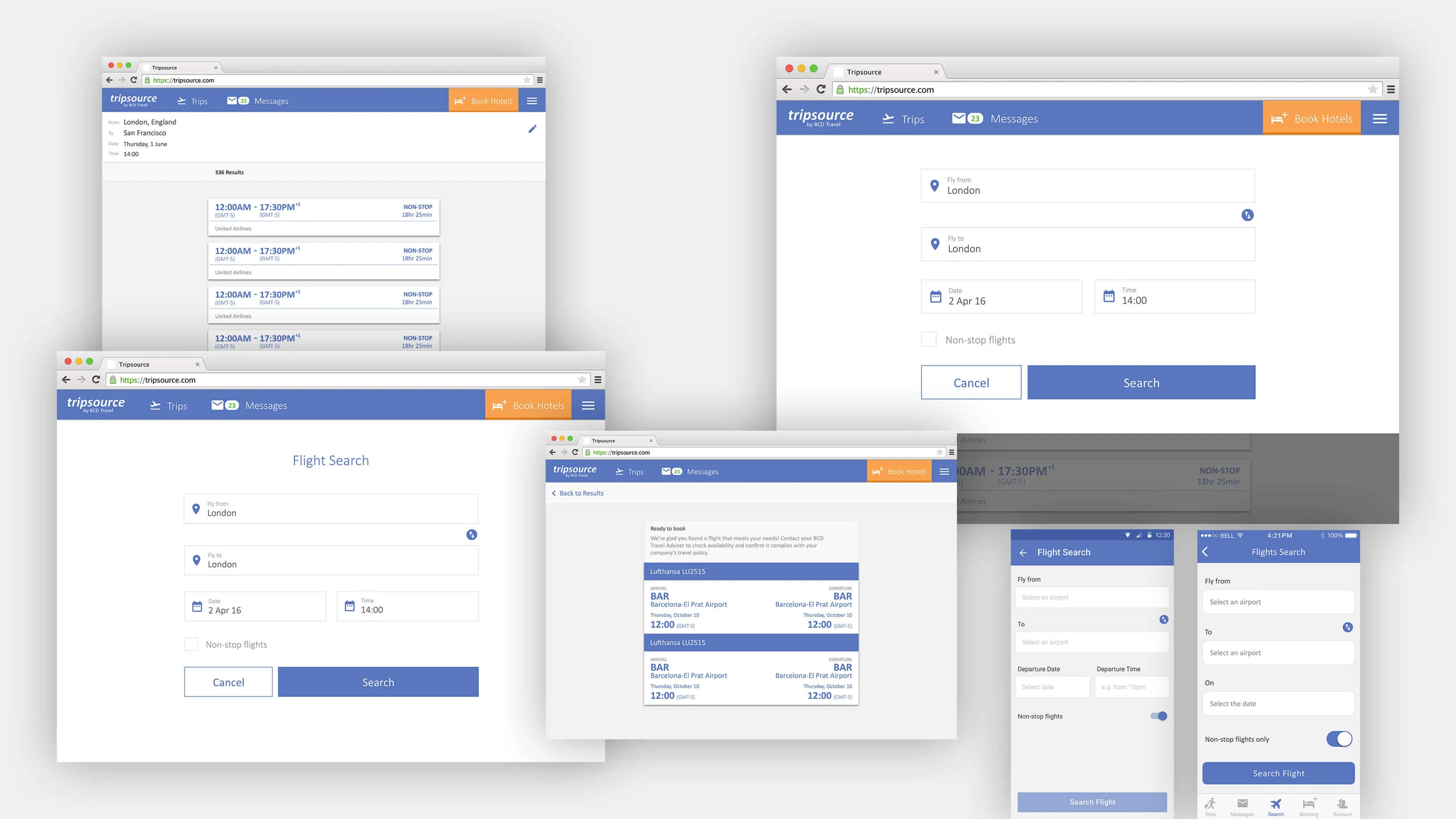
I led UI/UX on the project: developing concepts, creating low- and high-fidelity mockups, mapping user flows and presenting the major design deliverables to BCD Travel. My work on these deliverables ran from November 2016 to May 2017.
I worked alongside research, UX and product designers, a Product Owner, a Product Manager and seven developers. Paula supported the concept work; Andrzej partnered on the survey. Yuki and Karl O’Sullivan conducted the interviews that informed the design. My involvement ended during the payment-flow improvements.
03 / 09
Start with what travellers value
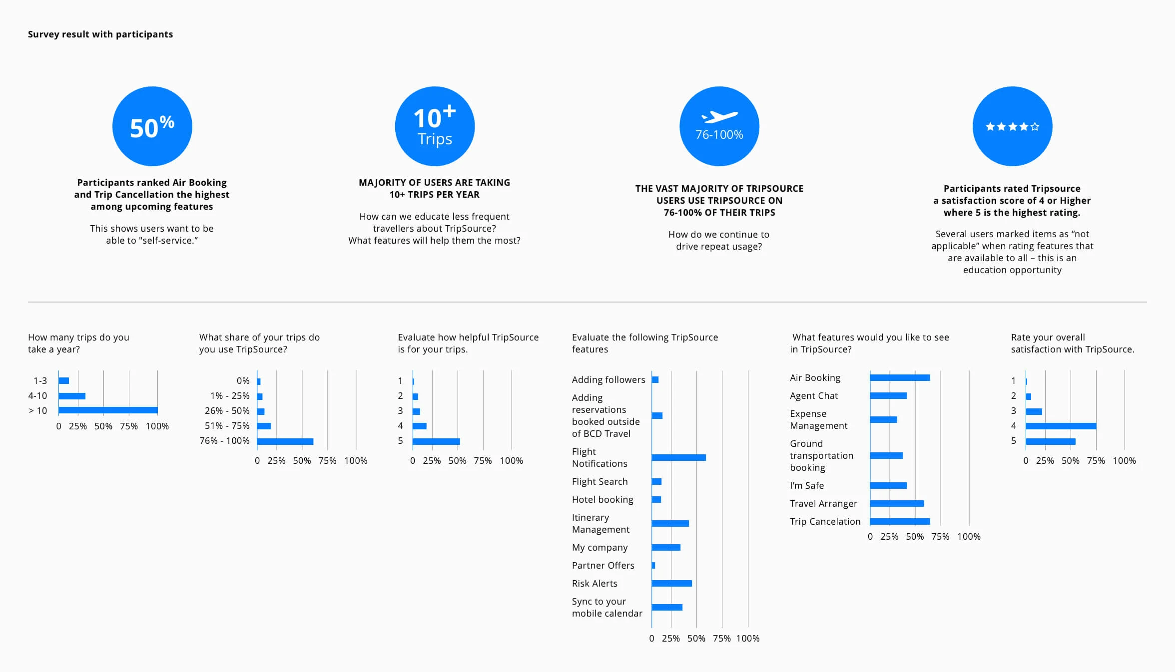
I partnered with Andrzej to understand perceived value, regional preferences and opportunities in the booking journey. We designed a survey that took less than seven minutes and pre-tested the questions with internal stakeholders to check comprehension.
The survey was sent to 20,000 active travellers in five supported languages. It ran for seven days, using push notifications and the message centre to reach people with a trip ending between 14 and 21 February. This was the invitation audience, not the number of completed responses.
In the reported findings, 50% of respondents ranked Air Booking and Trip Cancellation highest among upcoming features. That gave the team evidence to focus on booking rather than treating it as another item in an expanding feature list.
04 / 09
Understand the routines behind a trip
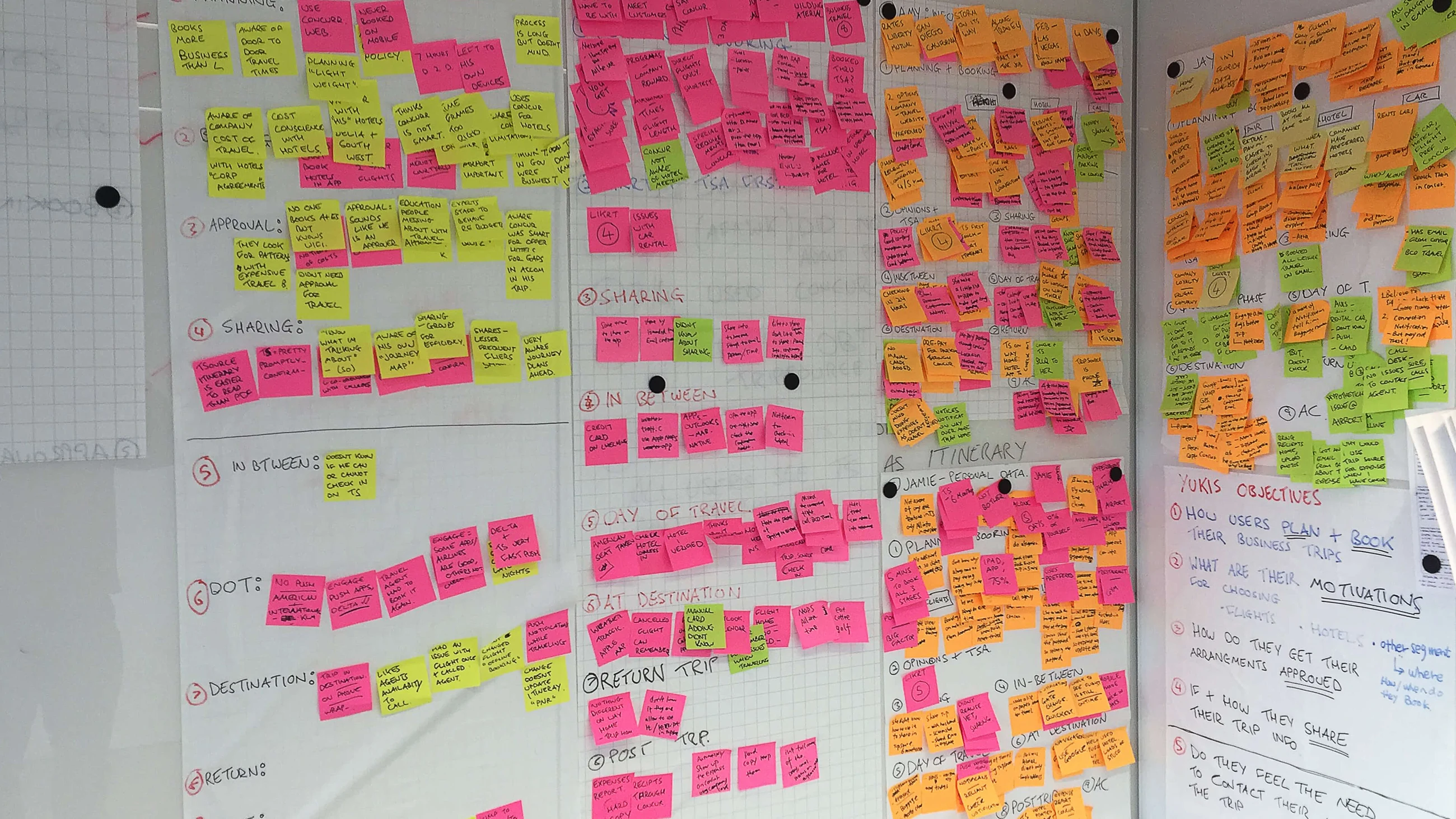
The interview research explored how business travellers planned and booked, what motivated their choices and how they used TripSource. It informed both the roadmap and the requirements for Air Booking.
Travellers often returned to the same airlines, rental providers and hotels. Familiarity reduced stress; they would go out of their way to preserve those routines. Booking was perceived as work, typically done at work, on a desktop. Company policy shaped their choices, but personal preferences still mattered.
Travellers wanted to reduce the time spent organising trips. Itinerary and notifications were working well, while trip sharing, importing trip items and support numbers were underused or difficult to find. Check-in and reusing previous trips or favourite segments were recurring requests.
05 / 09
Compare the market, then explore the options
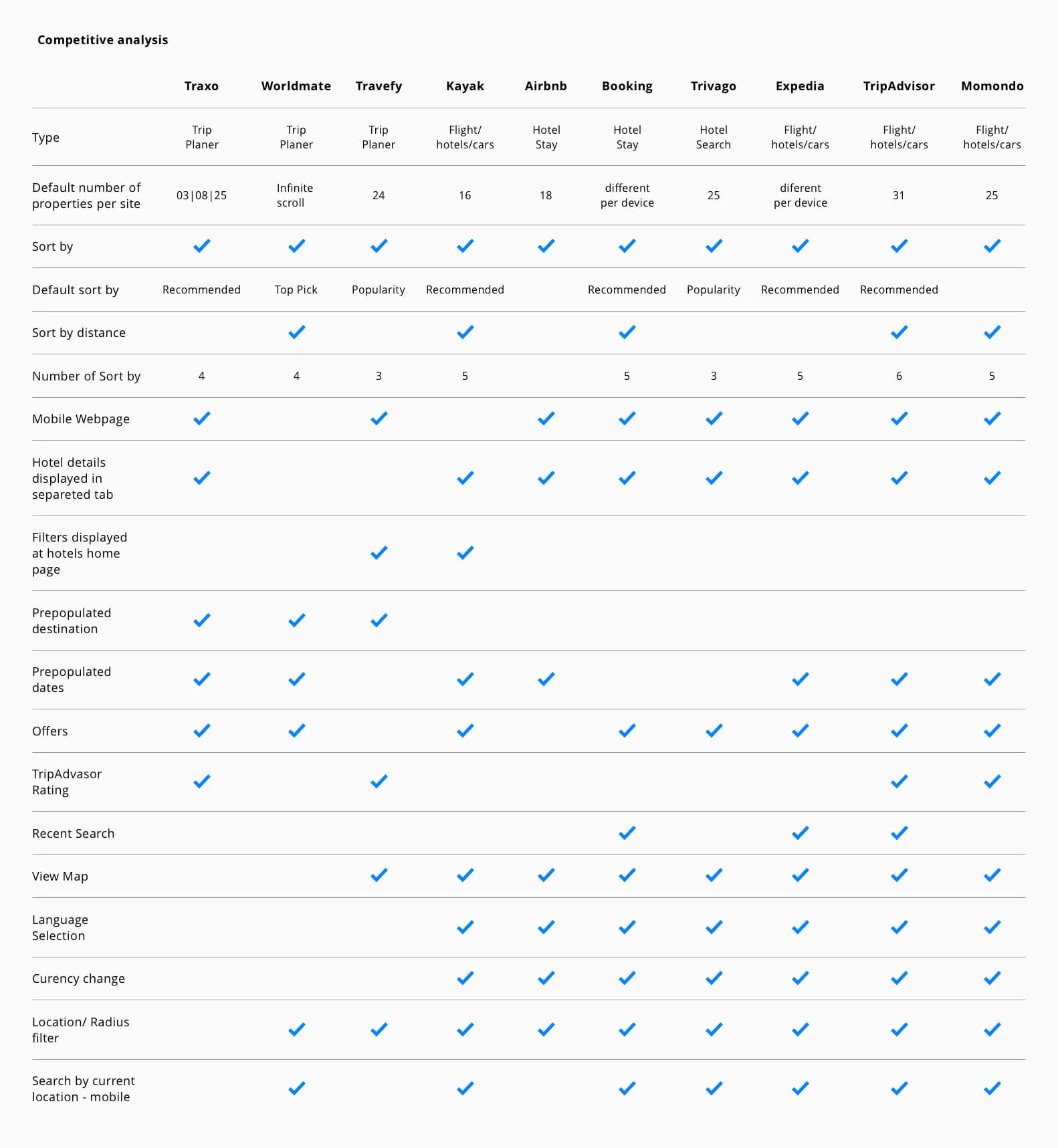
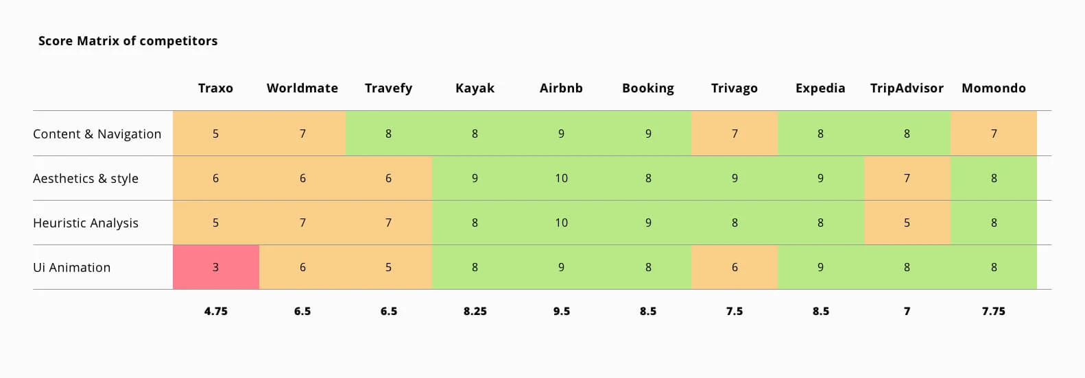
The competitive review examined products including Traxo, WorldMate, Kayak, Airbnb, Booking.com, Trivago, Expedia, TripAdvisor and Momondo. Alongside a feature comparison, we scored content and navigation, aesthetics, usability and interface animation.
I led a whiteboard session with Paula to generate 15 concepts for the problems identified in discovery. We selected the strongest directions for early feedback from BCD stakeholders and then business travellers.
The implementation approach combined native search screens with web-based parts of the booking flow. Shared patterns could reduce development effort, while alerts, dialogues and interactions still needed to feel appropriate on each platform.
06 / 09
Prototype the flow, not just the screens
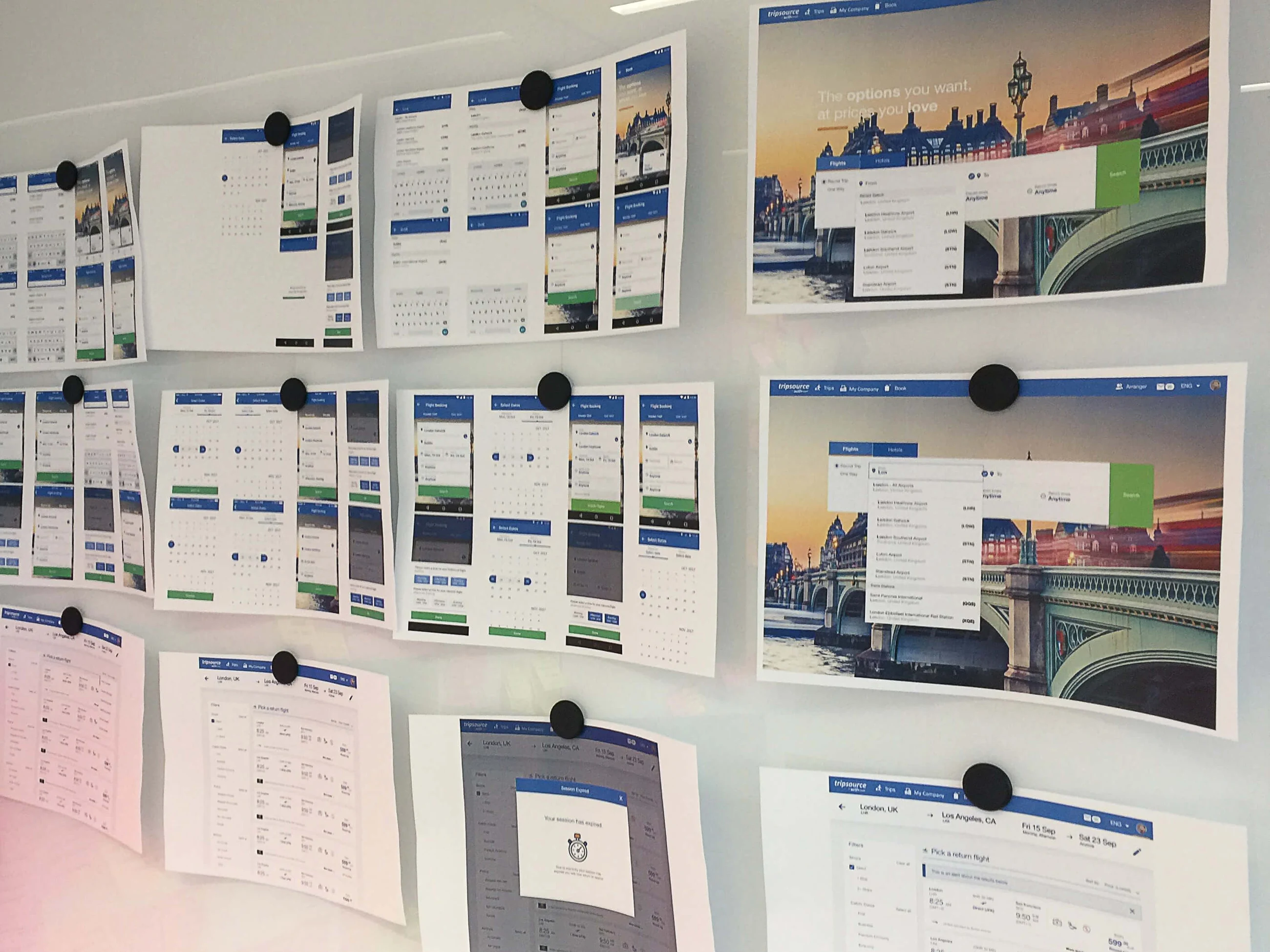
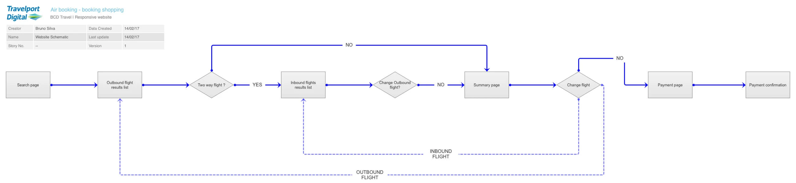
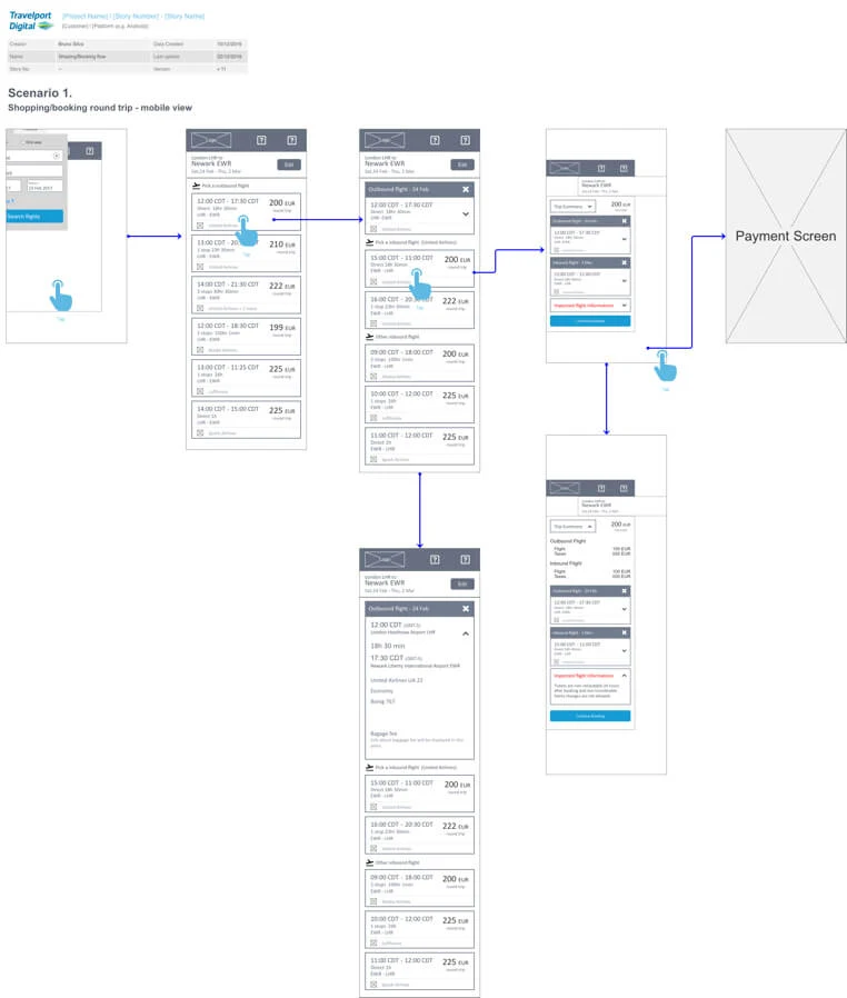
Low-fidelity wireframes established the sequence of decisions. High-fidelity prototypes then made the hierarchy and interactions tangible: which information needed emphasis, how a traveller moved between steps and where the interface introduced unnecessary effort.
We tested designs internally with BCD stakeholders before using the prototype in usability sessions. Sharing working flows early helped the team discuss the experience as a whole.
07 / 09
Test across three platforms
The usability study involved 18 participants across the TripSource website, iOS and Android app. It evaluated the key features in the flight-booking flow, including search, flight details, policy information, sorting and the payment summary.
Participants completed most tasks and generally described the experience positively. The search screen was considered simple and straightforward, and users found the Book entry point on all three platforms. The most critical issues appeared in the summary and payment screen.
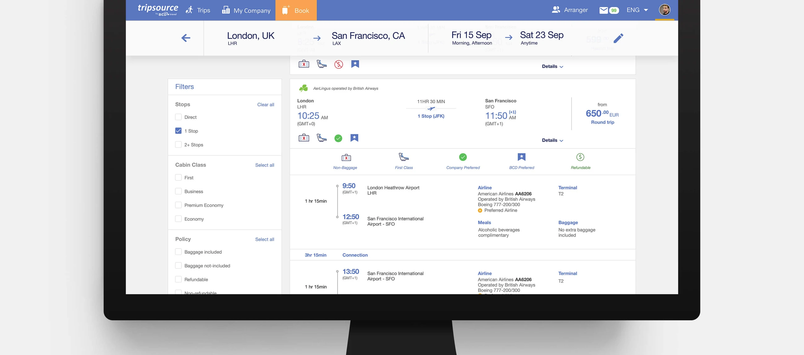
One specific problem cut across devices: “BCD preferred” was unclear to five of six iOS users, four of six Android users and all six desktop users. The remaining two Android users understood it but still wanted more information. A label that made sense inside the business was not explaining its value to travellers.
08 / 09
Make policy and preference understandable
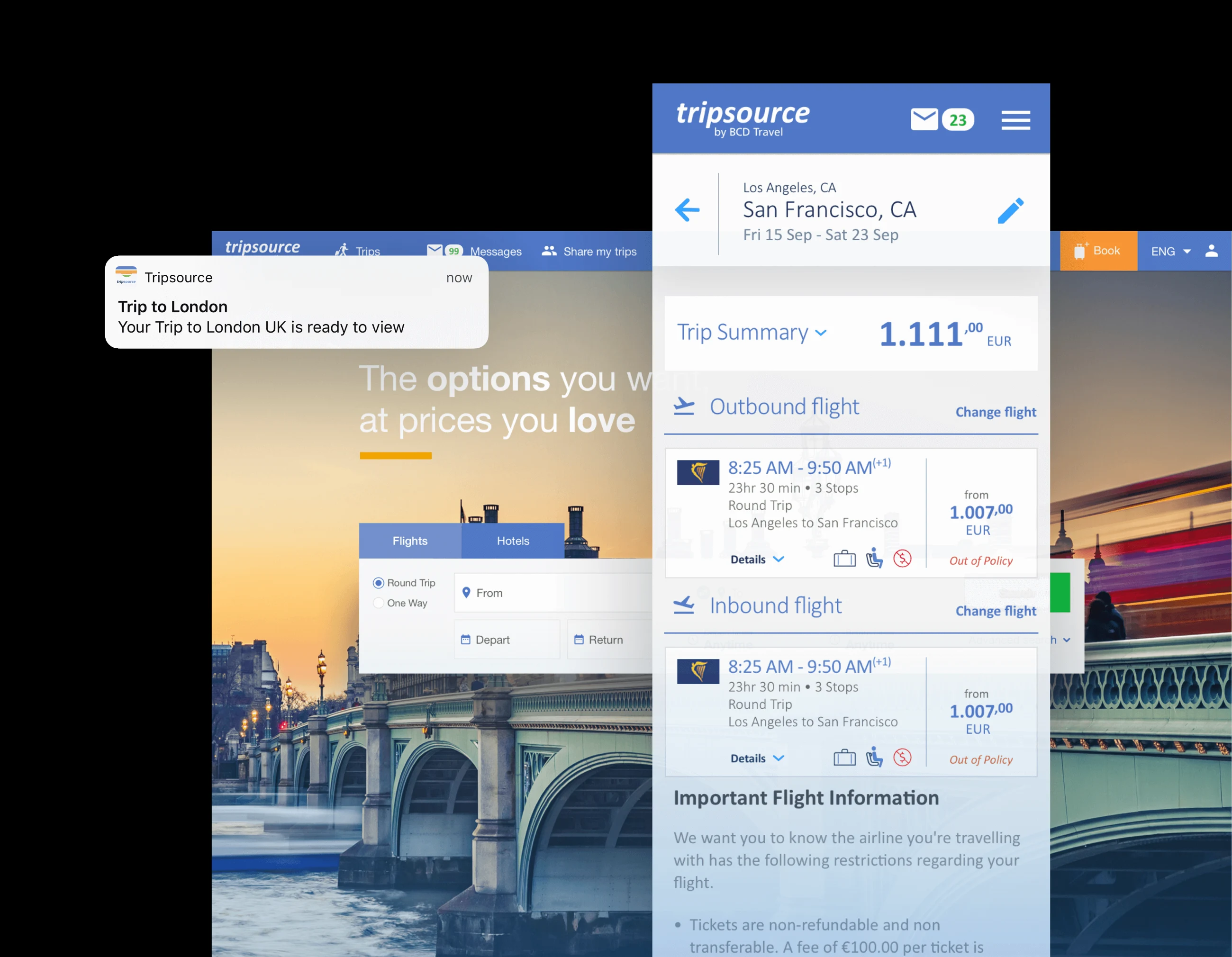
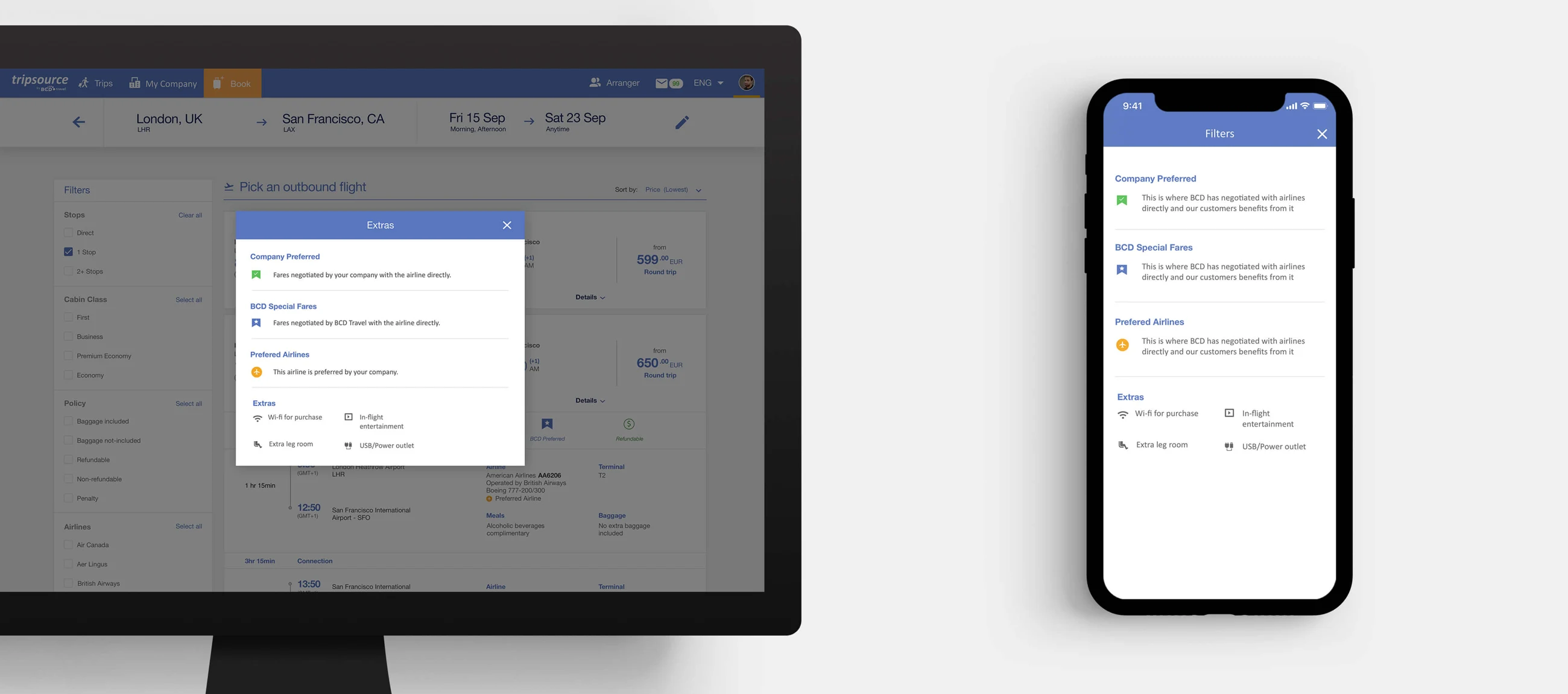
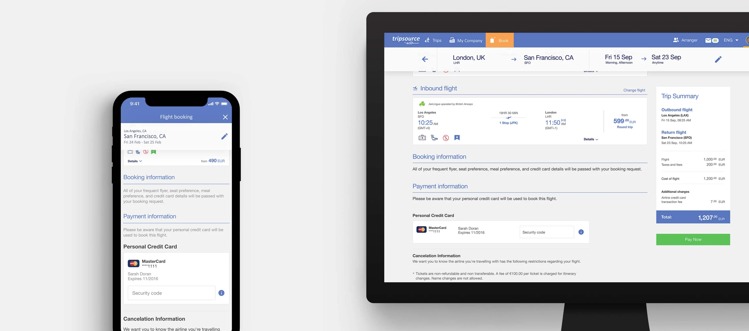
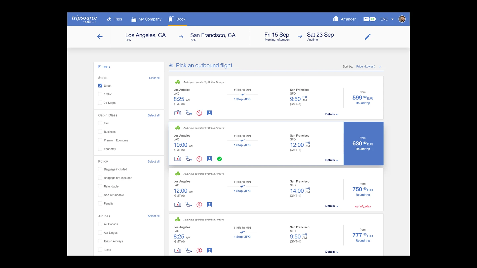
The proposed solution added explanatory information for “BCD preferred” and the other icons in the flight results. Travellers could understand the meaning of a recommendation while comparing flights.
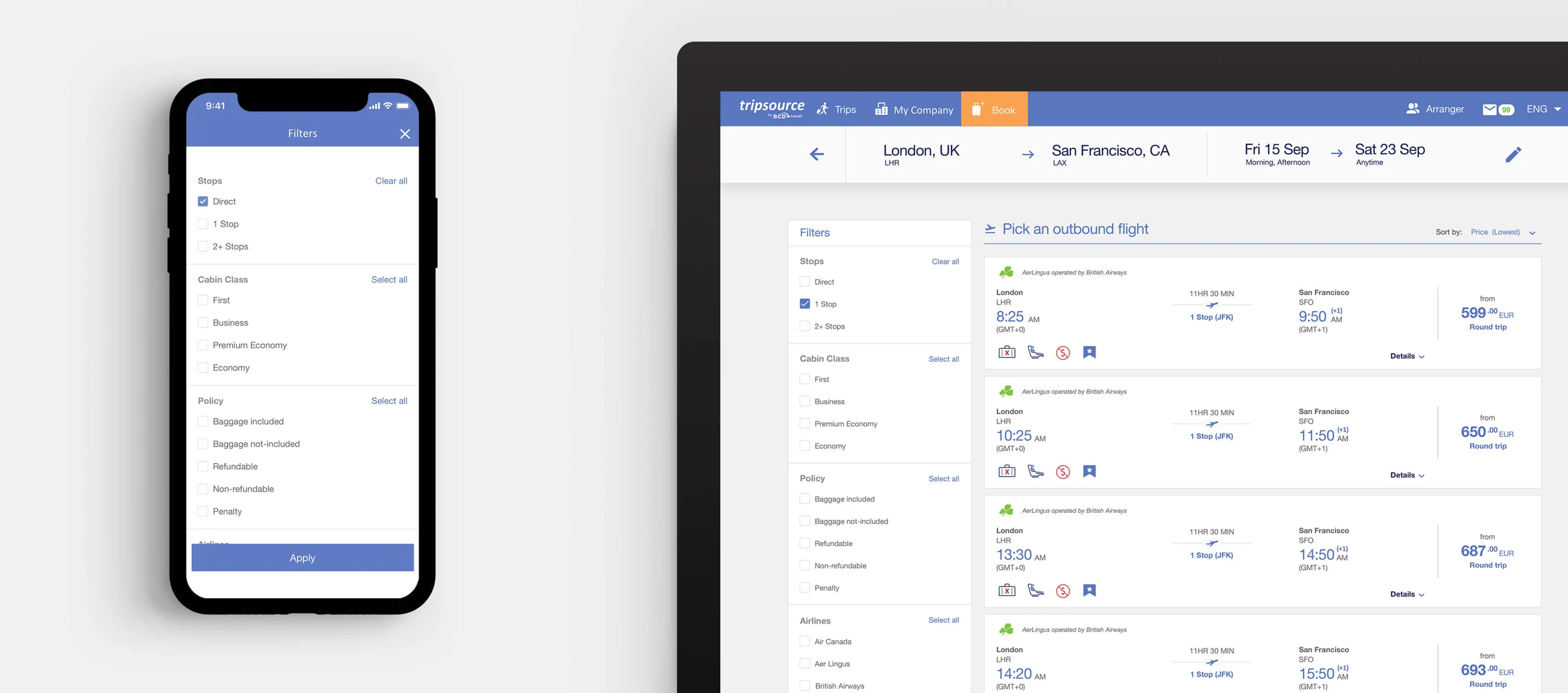
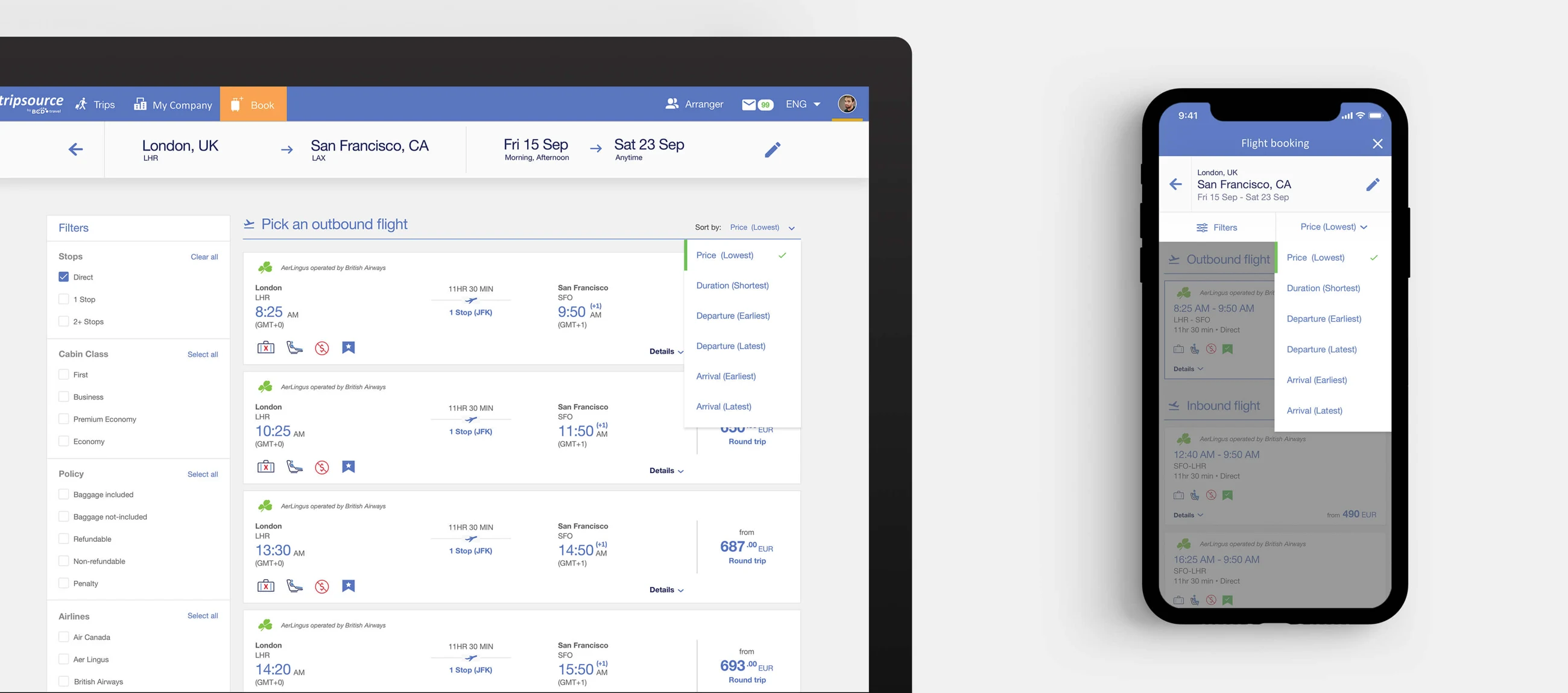
Sorting performed well in the study: participants found and applied it easily. The design also included filters, detailed flight information and a clearer summary of the booking. These screens show the design direction, rather than a claim of measured post-launch improvement.
09 / 09
What I took forward
A small interface decision can touch policy, commercial relationships, engineering and the traveller’s expectations. This project reinforced the need to understand those connections before changing a screen.
A useful product also has to support a viable business. The challenge was balancing traveller needs with company policy and the operational realities of business travel. The research and usability findings document the design decisions; they do not establish a post-launch conversion or revenue result.