Product design
LoungeKey
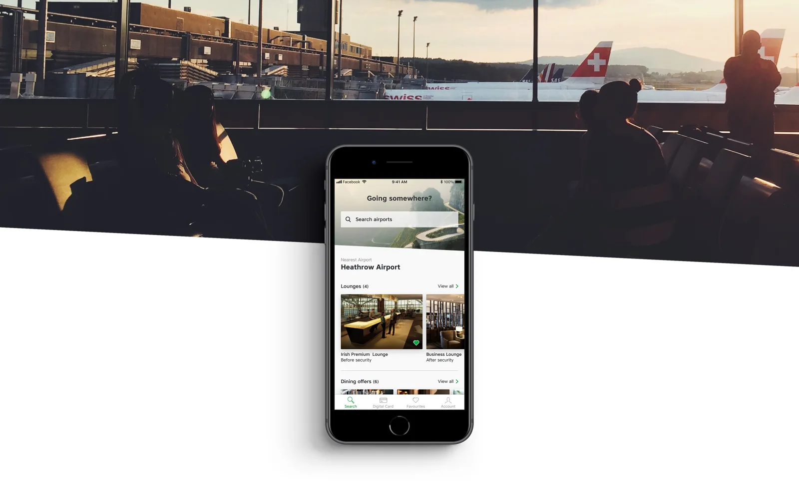
One airport experience. Many banks, brands and travellers.
01 / 07
A shared product with many identities
LoungeKey gives eligible cardholders access to airport lounges and other travel benefits. The brief went beyond refreshing an app: the experience had to support a white-label model for a network described in the original project as more than 600 banks, 90 airlines and 20 hotel groups.
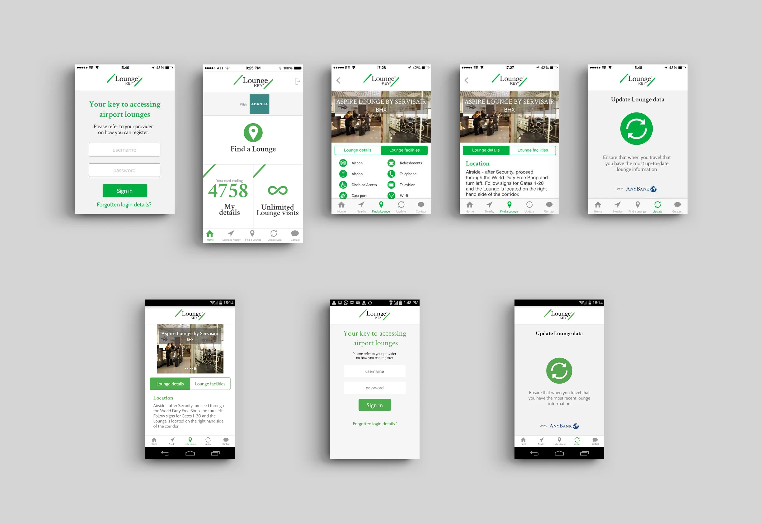
The team built an initial MVP and continued to evolve it through feedback. The design had to help travellers find relevant benefits while accommodating different commercial partners and distinct brand expressions.
I partnered with Product Designer Rosa Whyte on experience strategy and design for iOS and Android. We worked with the Business Lead and Product Owner, and with developers in Moldova. I led the UX, UI and visual-design work presented here and produced and co-presented the major deliverables.
02 / 07
Fix the foundations before adding more
The client wanted dining redemption, discount offers and other benefits added to an app that had not kept pace with the product. Users struggled to log in and find airports, and had to download data manually before accessing airport information. The brand had also changed.
We framed three goals: make lounges, restaurants and offers easier to find; reduce friction in the existing experience; and update the visual identity to reflect the more premium brand direction.
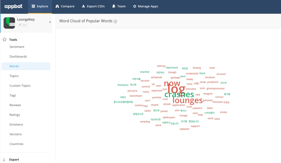
I began by reviewing the screens, interactions, content and information architecture. I then analysed App Store feedback with Appbot. Recurring complaints concerned failed logins, difficulty finding airports, crashes and duplicate lounge imagery.
03 / 07
Keep the traveller and the buyer in view
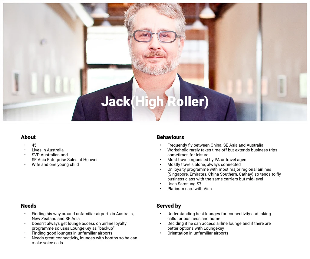
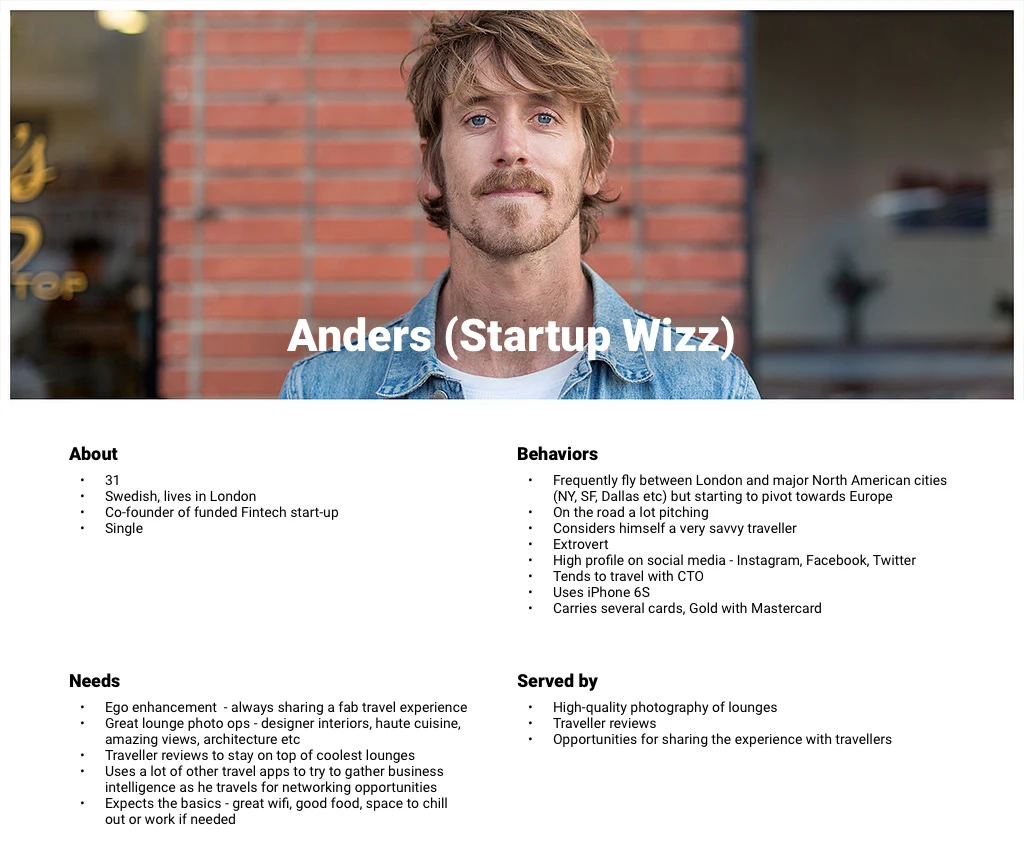
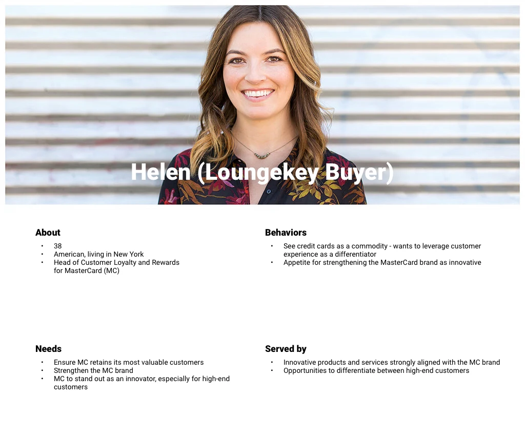
Working sessions with the client helped us define three proto-personas and the tasks that mattered to them. These were alignment tools based on the available knowledge, rather than a claim of a new representative segmentation study.
The personas included a frequent traveller, a startup traveller and a loyalty buyer. The buyer mattered because a white-label product has to work for the person distributing it as well as the person using it at an airport.
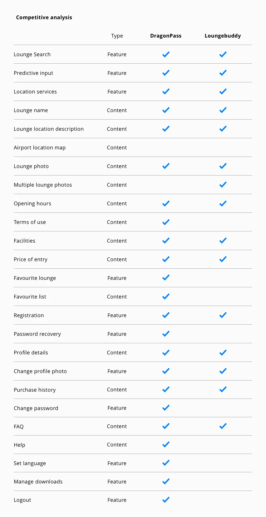
I also reviewed DragonPass and LoungeBuddy to compare features and content. The analysis helped identify opportunities and avoid repeating existing usability problems.
04 / 07
Map the essential journeys
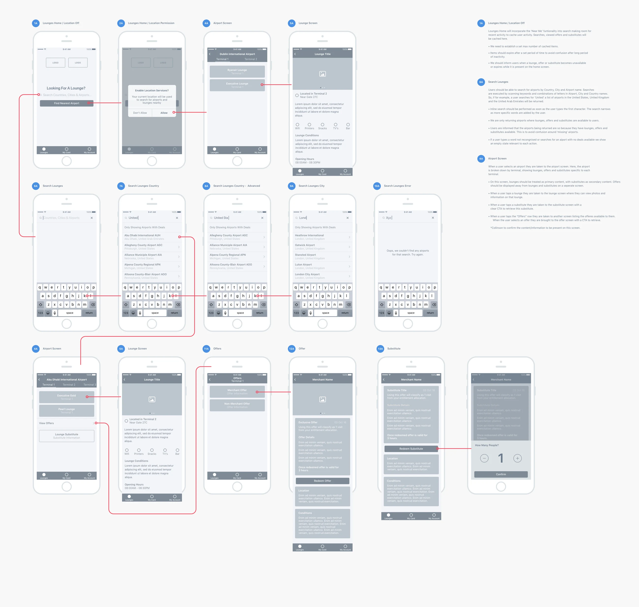
I explored iOS layouts while Rosa worked on Android. Sketches and wireframes gave the team a low-cost way to discuss assumptions before committing to the visual direction.
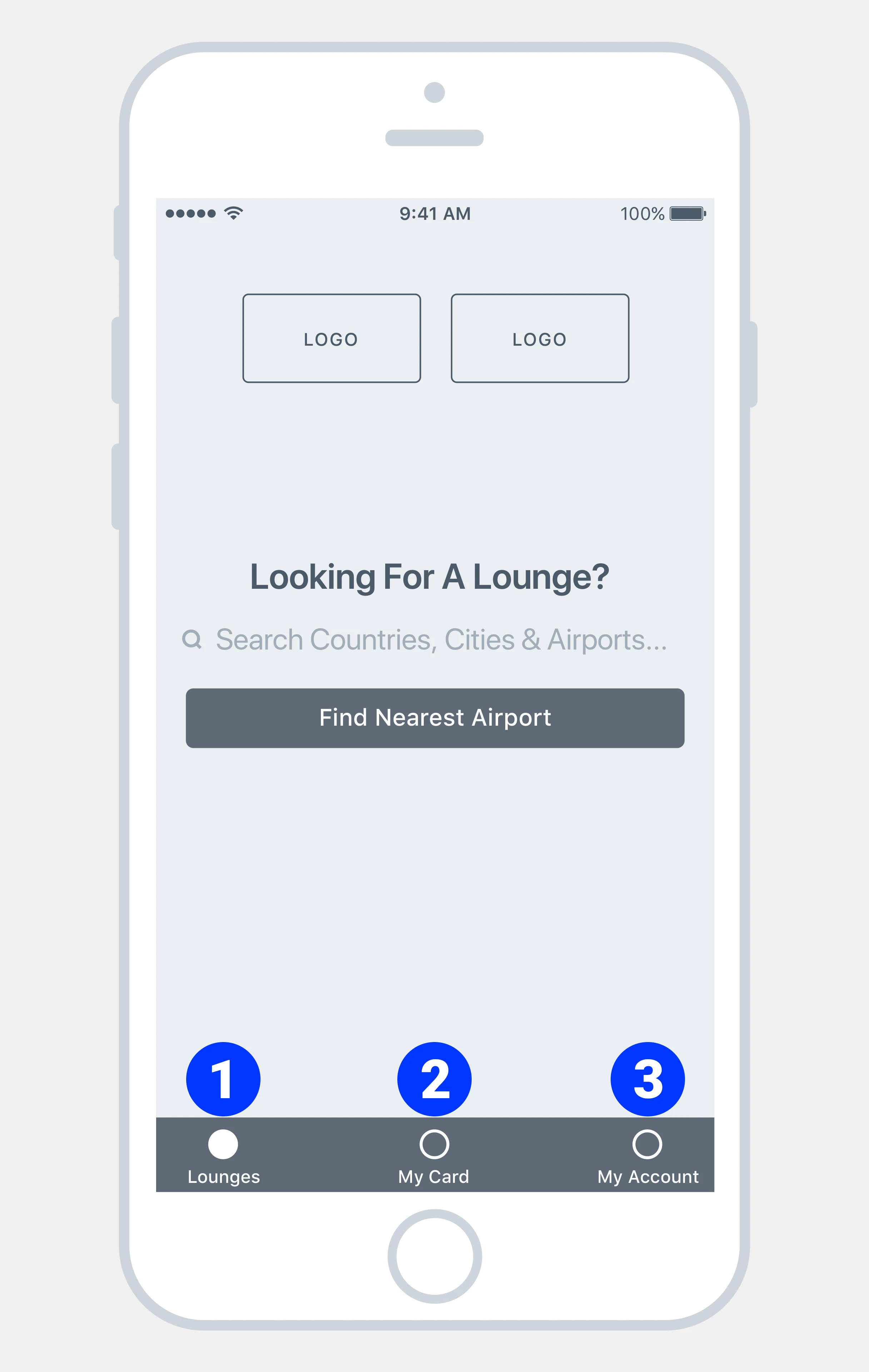
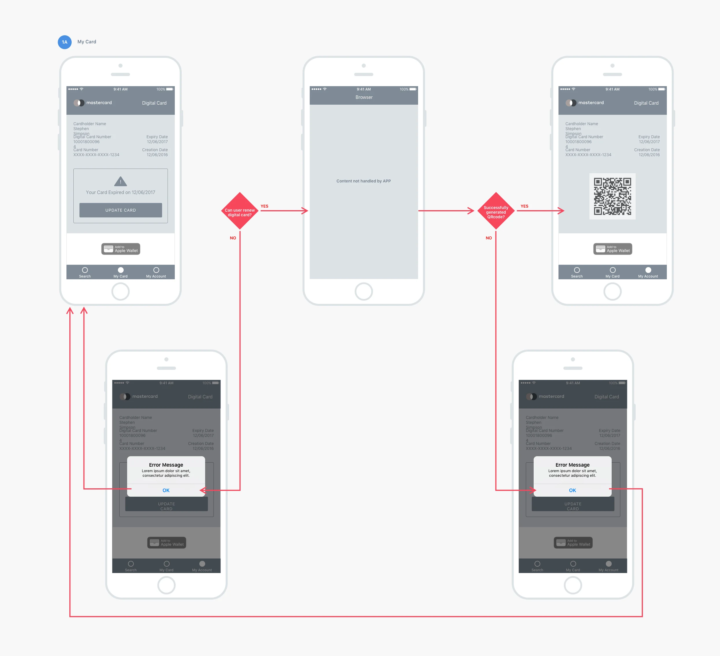
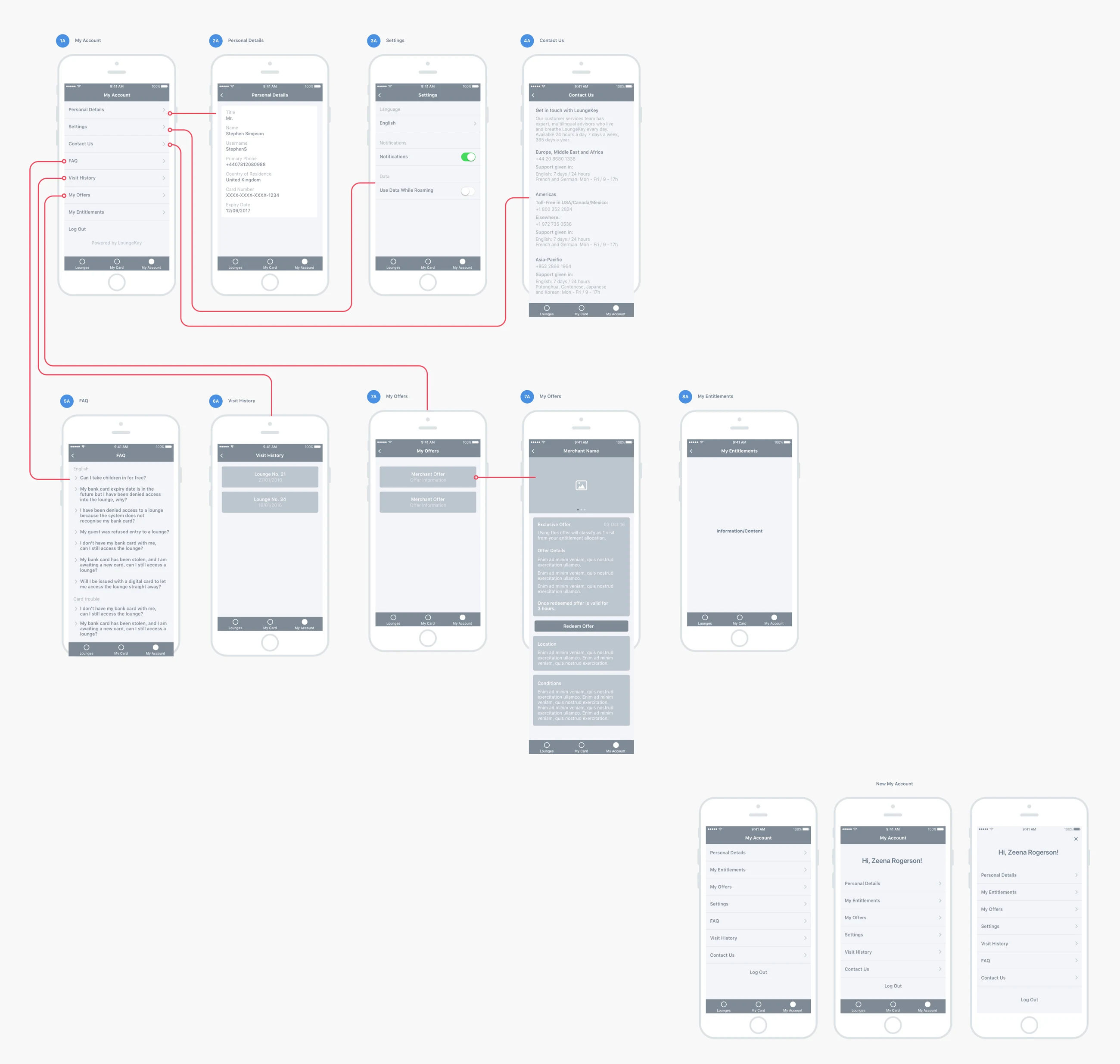
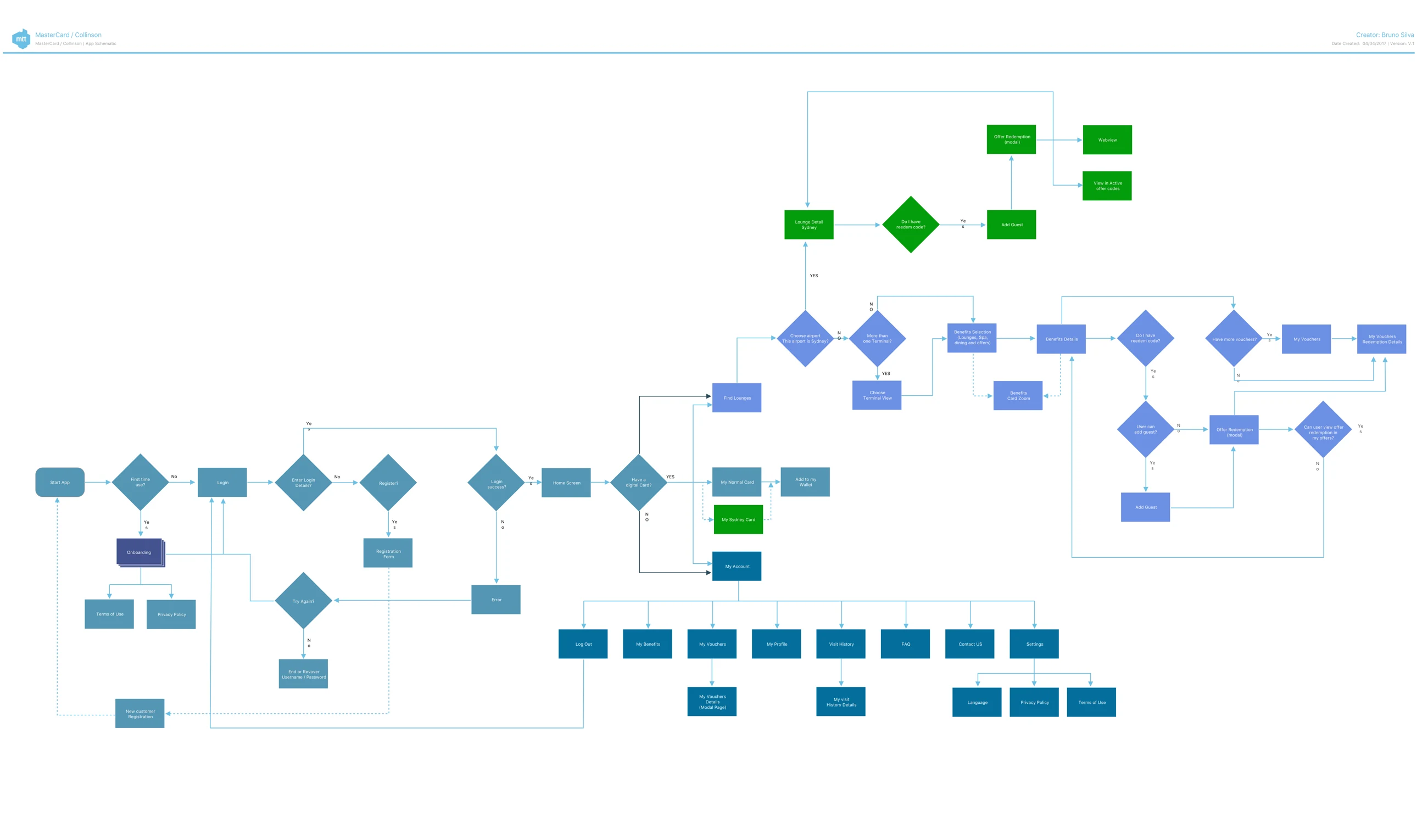
The initial navigation centred on three destinations: Lounges, My Card and My Account. We mapped the home-screen journey, card access and account flows, then assembled the app schematic to evaluate the architecture as a whole.
The card flow made expiration visible, reducing the need for travellers to remember the status of their benefit. Account explorations examined how settings and benefit information could fit together.
05 / 07
Validate the experience with 29 participants
High-fidelity designs established the visual direction for Mastercard and Visa LoungeKey. The client wanted different looks and feels for the two competing brands. A workshop aligned the design with the roadmap and product strategy.
In December 2016, a usability study tested the prototype with 29 participants. The goals were to evaluate findability, identify journey improvements and understand the app’s usefulness.
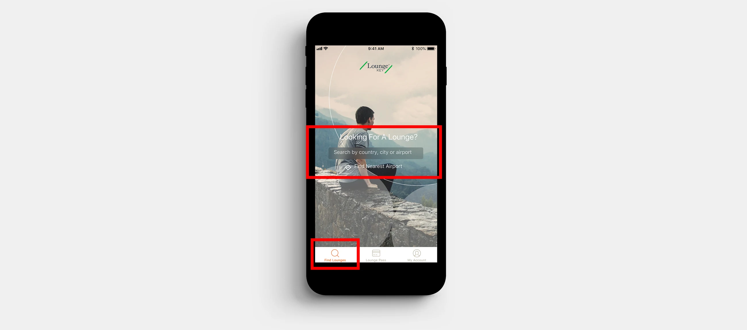
Participants generally received the app positively, but the navigation revealed two important problems. “Looking for a lounge” was also the entry point for spas, restaurants and retail offers. That label did not describe the full range of content behind it.
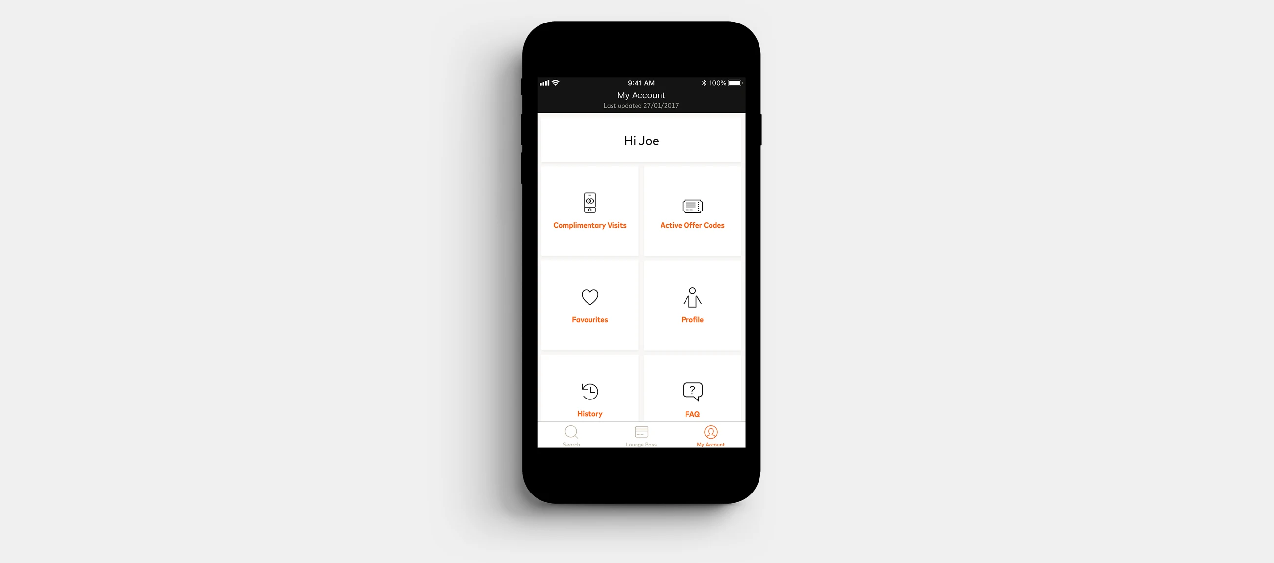
Finding the remaining complimentary experiences was the most confusing task: 28% did not expect that information under My Account → My Benefits. My Account was also an unintuitive place for FAQs and settings.
06 / 07
Let the findings change the structure
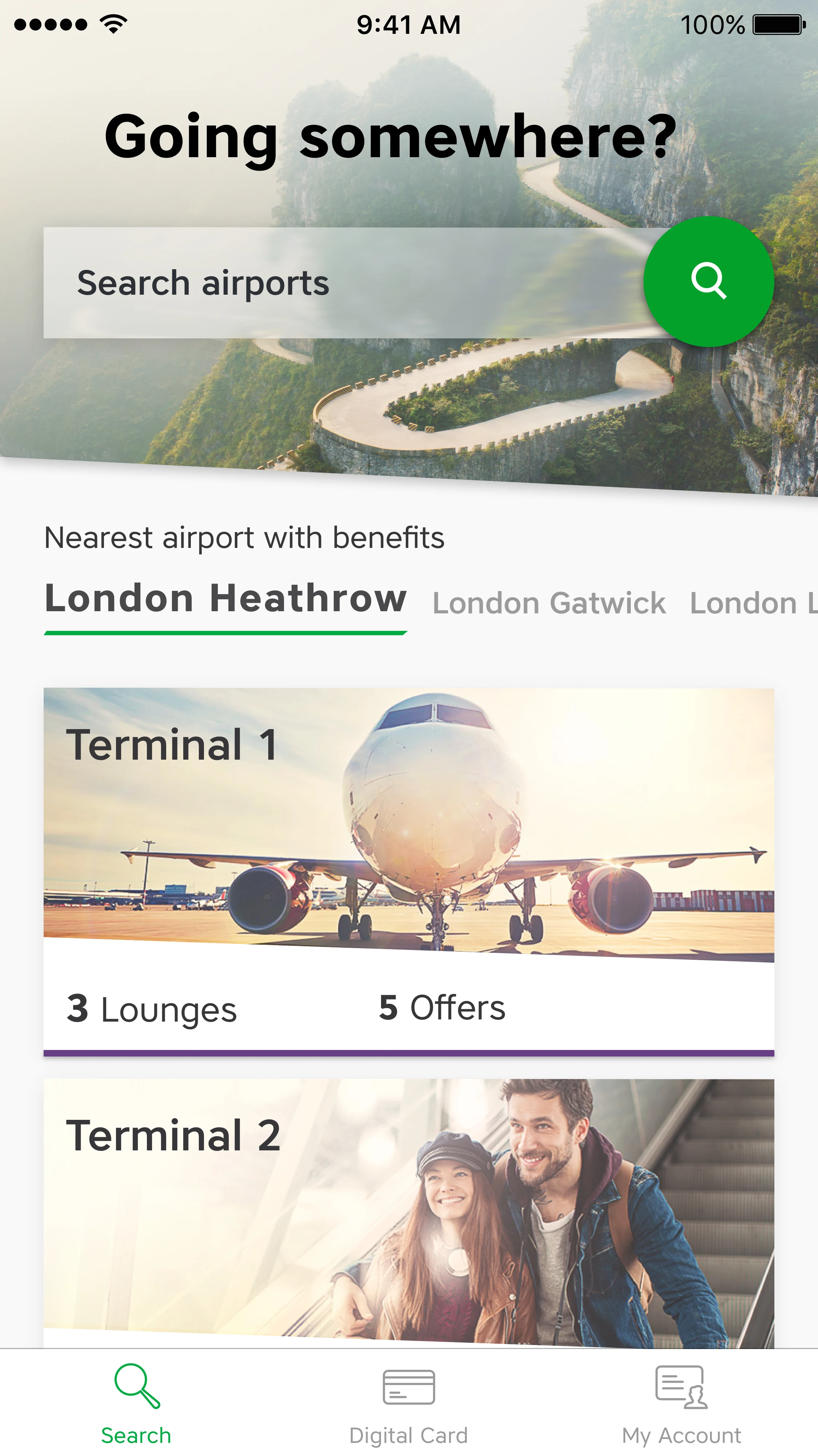
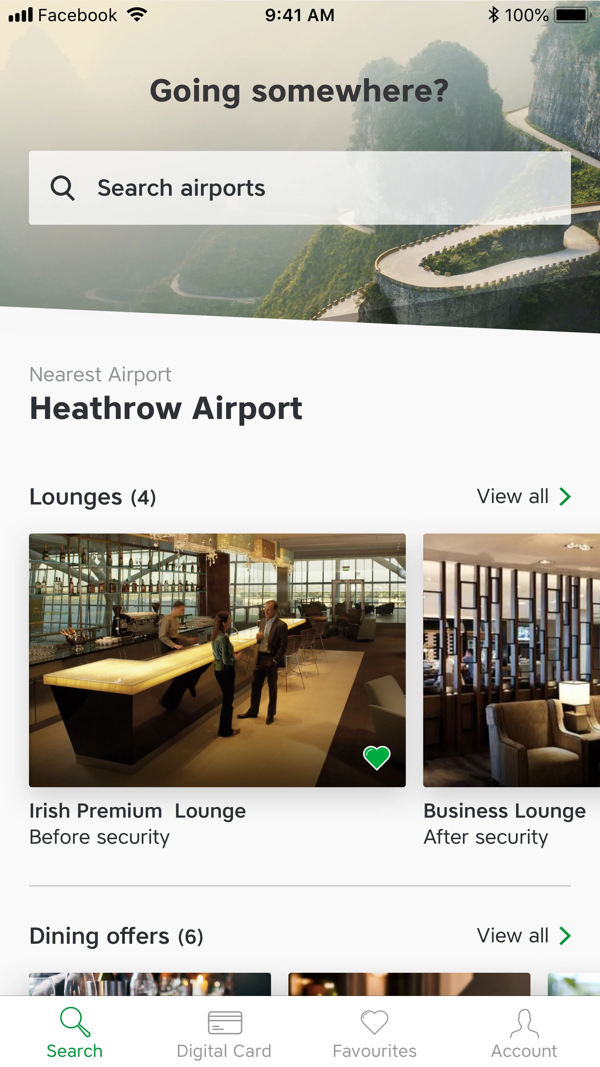
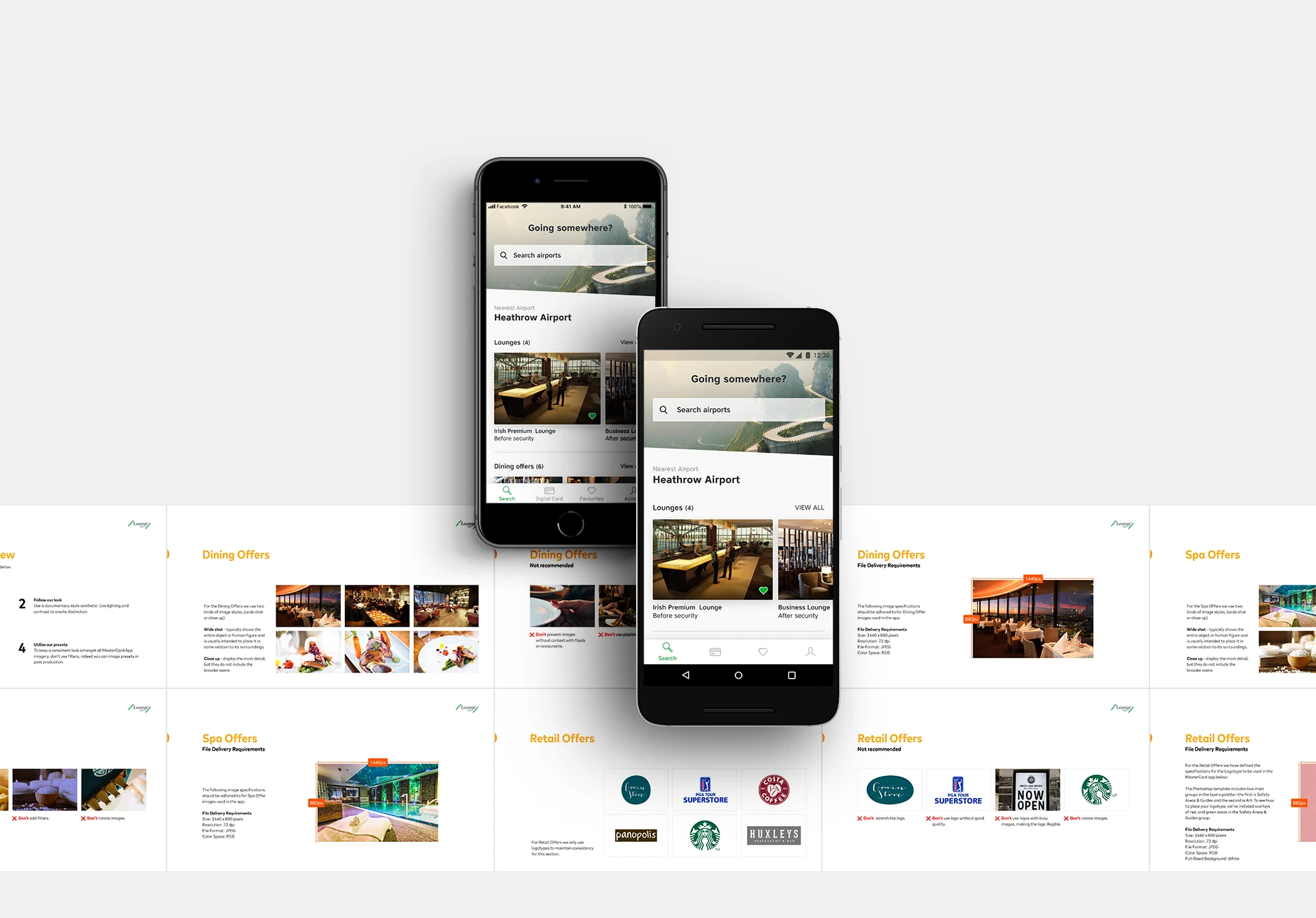
The recommendation was to use a more general entry label for the broader set of airport benefits, and to revisit the account architecture using familiar navigation patterns. The later direction opens with “Going somewhere?” and airport search.
The visual work developed through an MVP, an intermediate design and a later proposed direction. The original case distinguishes these stages; the final proposal should not be confused with the version that was live at the time.
I used high-fidelity interaction prototypes to discuss transitions and behaviour with the client and engineering team. The final screens show the evolution across iOS and Android.
07 / 07
Make content quality part of the design
The quality of lounge and restaurant photography affected the perceived quality of the app. We created image guidelines with examples and dos and don’ts to help the sales team make better content choices.
Working with the client also meant introducing a more iterative way of delivering the product. One lesson from the original project was the need for deeper analytics and user insight. The usability study supported specific changes, but no verified post-launch outcome is claimed here.