Design exercise
Workday recruiting
Help recruiters see what needs attention, and act on it.
01 / 06
A focused enterprise-design challenge
The Workday recruitment brief asked me to review the existing My Recruiting Jobs screen and redesign it so recruiters could identify what needed attention and take action. The time limit was three hours, with designs following Workday’s visual language.
The output was an exercise in prioritisation and interface craft, not a live Workday release. I used the supplied recruiter information to frame the problem before exploring desktop and mobile solutions.
02 / 06
Understand the recruiter’s task
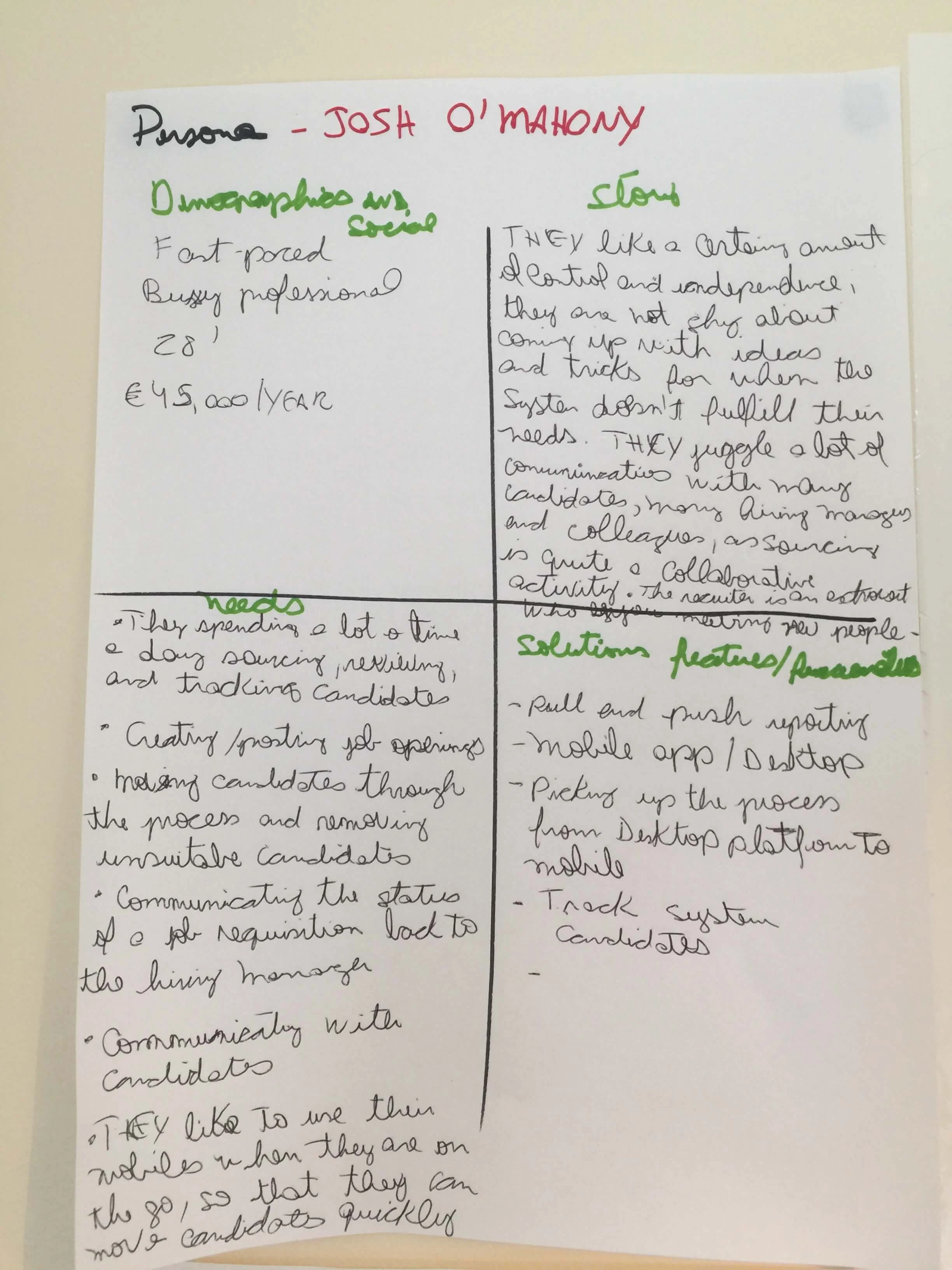
The persona, Josh, was based on information provided with the exercise. I used it to consider the job openings a recruiter needed to monitor, the information required for a decision and the actions that should be available.
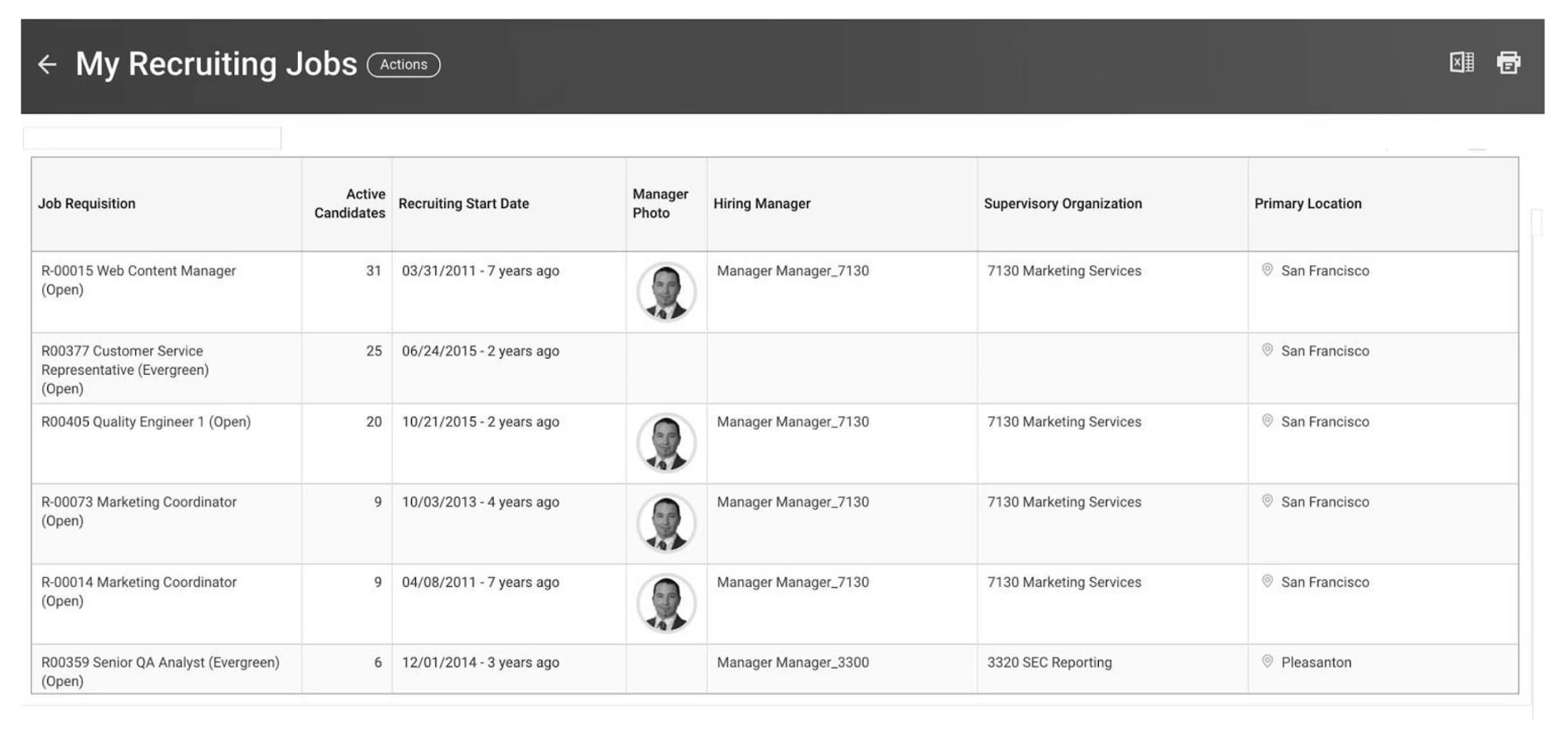
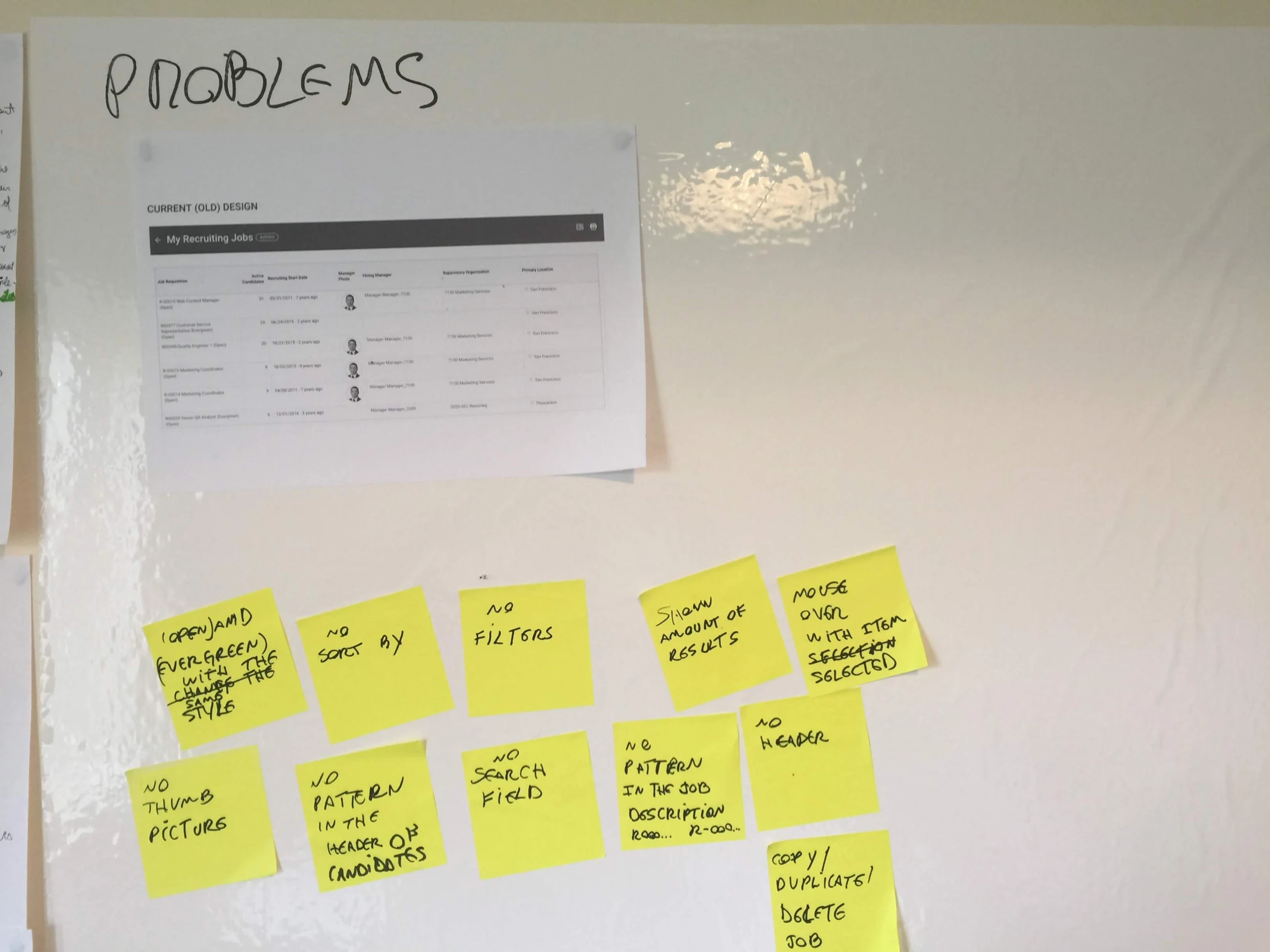
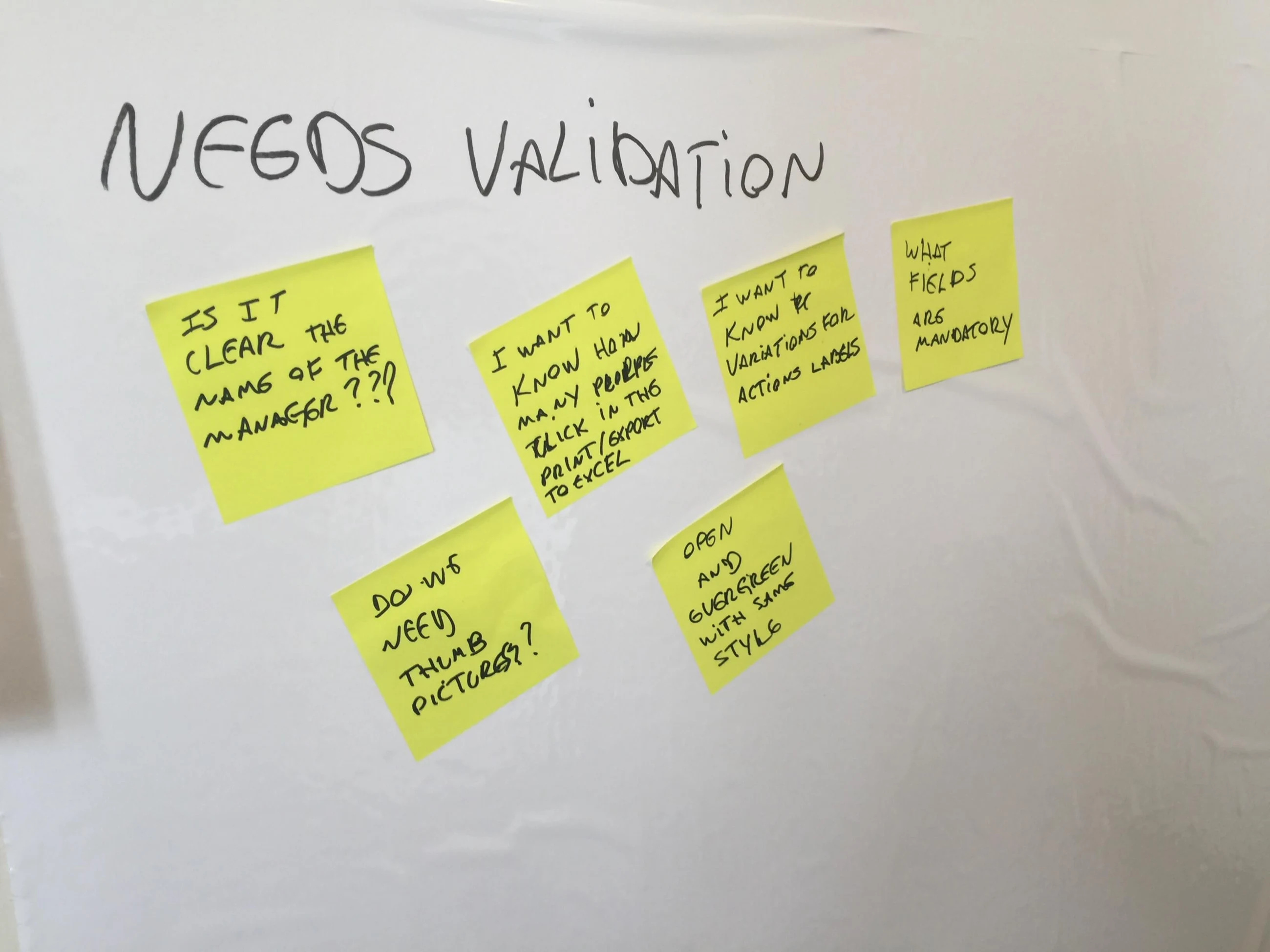
The initial review identified weak hierarchy and missing support for managing a large list. Open and Evergreen statuses had the same treatment; sorting, filtering, result counts and clear row states were opportunities to explore.
I also noted inconsistent job-description headings and opportunities around search, navigation and job actions such as duplicating or deleting. These were design assumptions to validate, rather than findings from a usability study.
03 / 06
Prioritise within the constraint
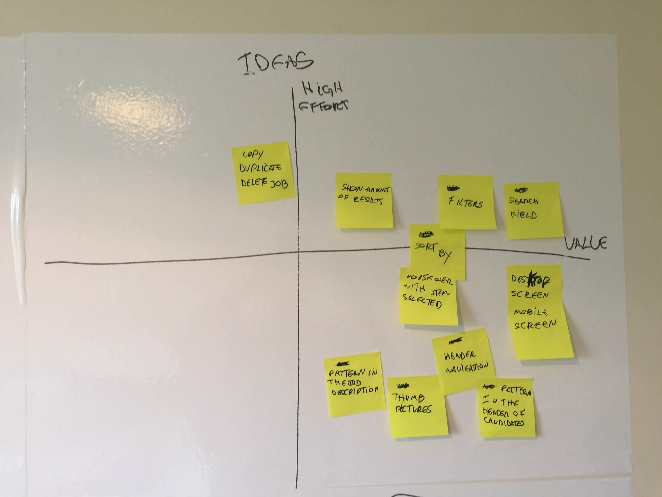
I compared ideas using reach, customer value, business value and implementation effort. Within a short exercise, the goal was to make the core task clearer rather than attempt a complete recruiting product.
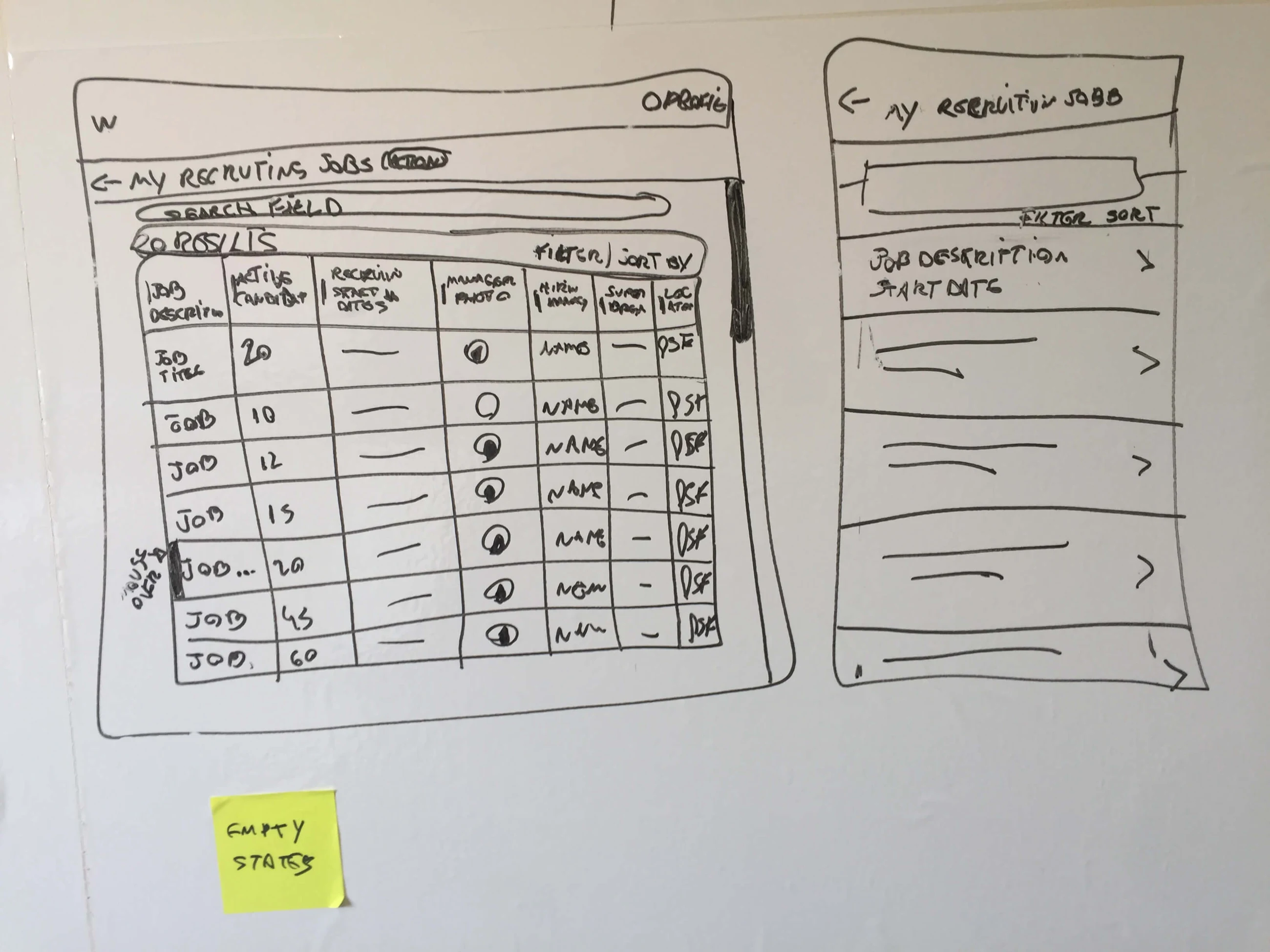
I sketched one direction for desktop and another for mobile. This allowed me to consider the same information under very different space constraints before committing to high-fidelity screens.
04 / 06
A clearer recruiting workspace
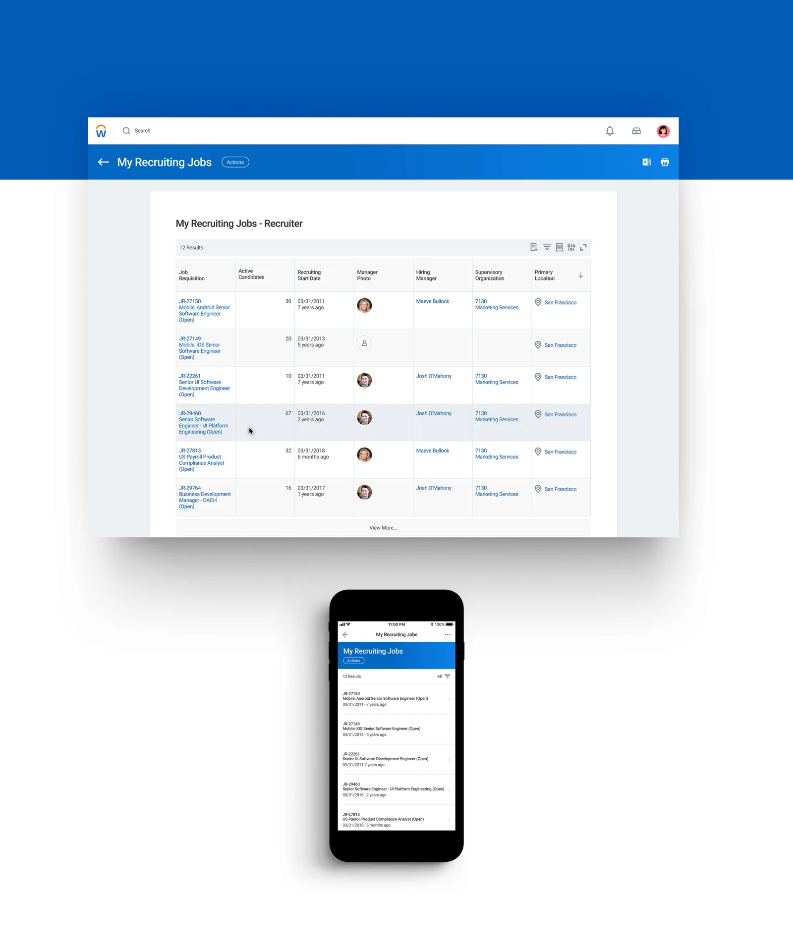
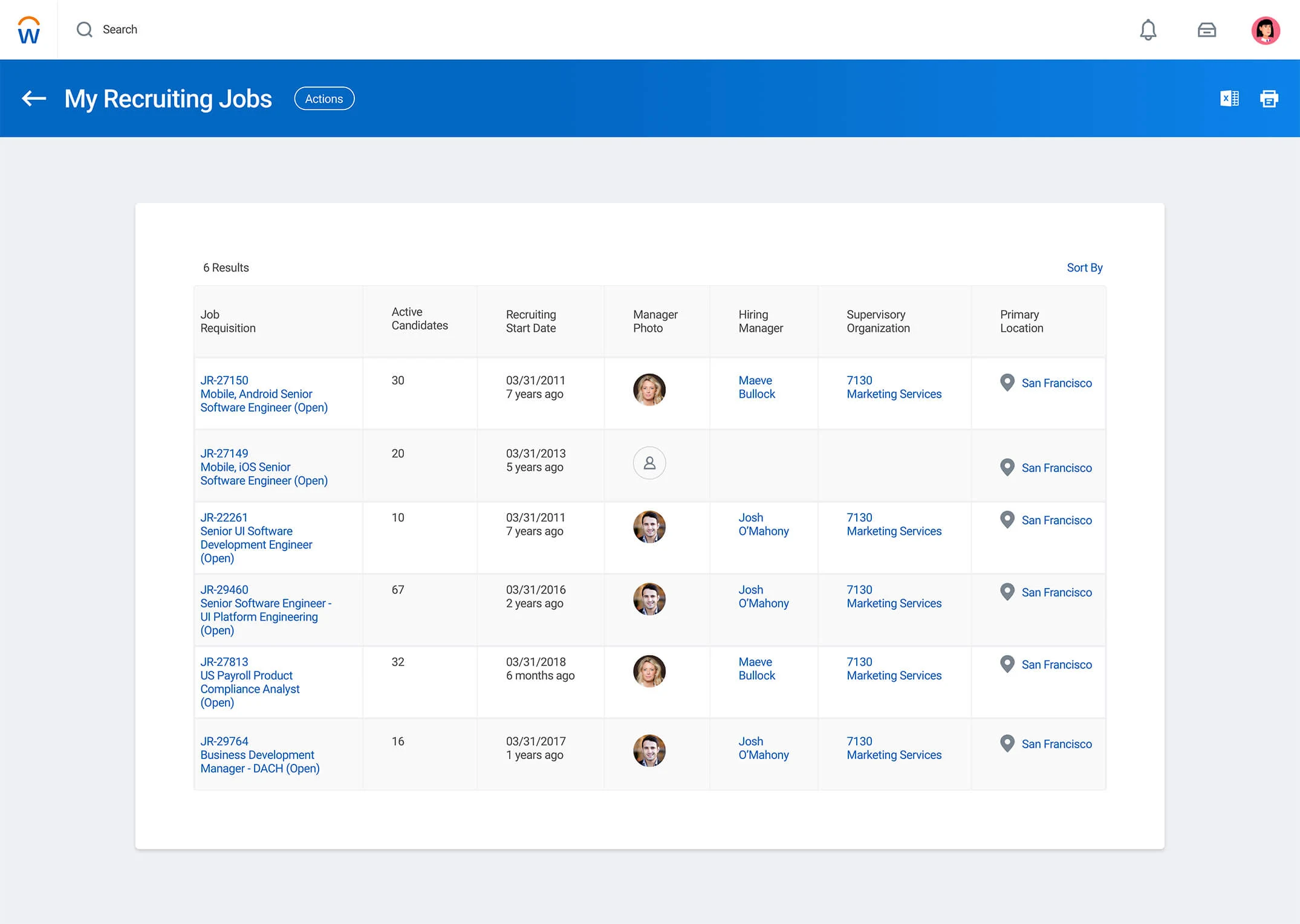
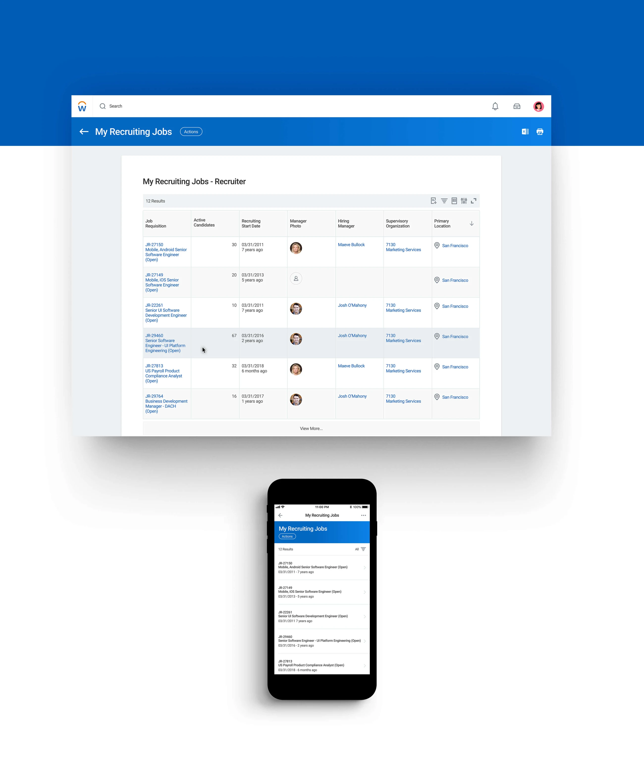
The desktop proposal retained the information density recruiters need, while improving the hierarchy of job requisitions, candidate counts, recruiting dates, managers and locations. Result counts and a clearer list structure helped make the page easier to scan.
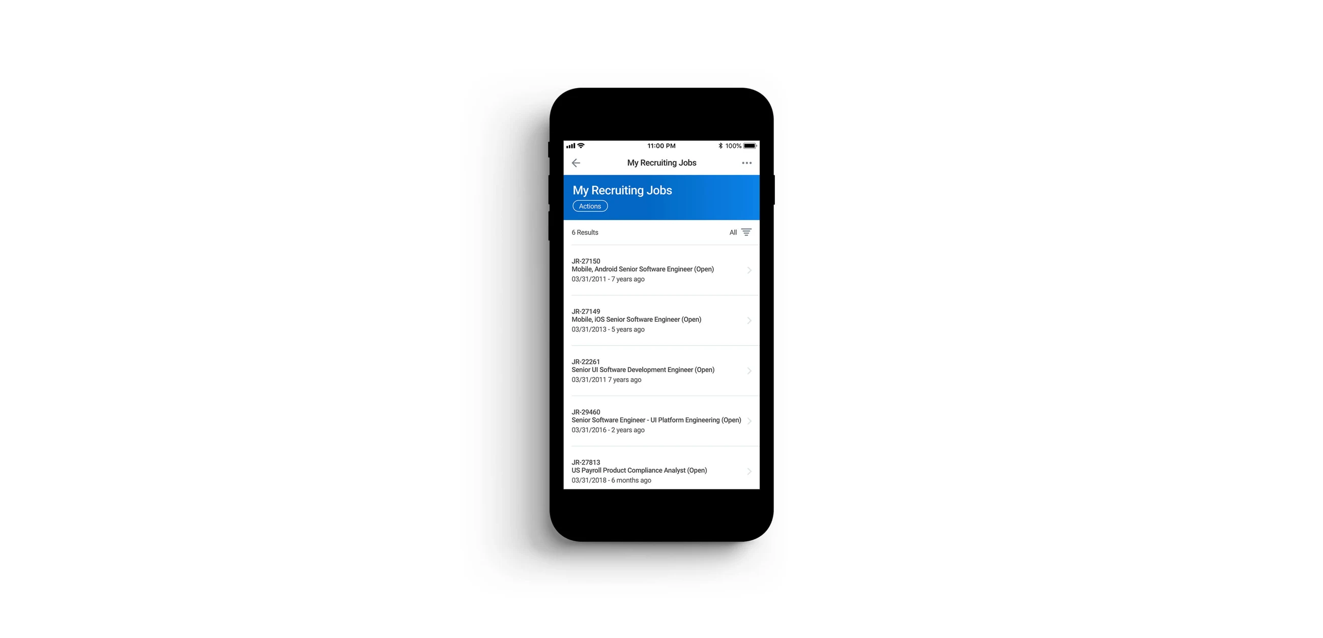
The mobile version presented the same task in a compact list. The intention was to support quick identification of a role and its state without carrying every desktop column into a narrow viewport.
I followed the Workday design language as closely as the exercise allowed. The screens show the proposed solution; further testing would be needed to establish whether it improved real recruiting work.
05 / 06
Prototype the interaction details
The original work included examples for both platforms: hover and link behaviour on desktop, and content scrolling on mobile. These interactions were part of communicating how the interface should behave, beyond a static layout.
With more time, I would refine the micro-interactions and validate the assumptions with recruiters handling realistic workloads.
06 / 06
Define success before shipping
The proposed measures were a reduction in the time required to manage a large number of job openings, while maintaining or improving recruiter satisfaction. Those measures would need to be agreed with a Product Manager or Data Analyst before a real release.
The main lesson was how much can be made explicit in a short exercise: a user context, a prioritised problem, alternative sketches and a tangible direction. More evidence would be necessary before treating that direction as the right product decision.