Usability research
KrisFlyer registration & offers
Finding the friction hidden inside a completed registration.
01 / 07
Understand completion and abandonment
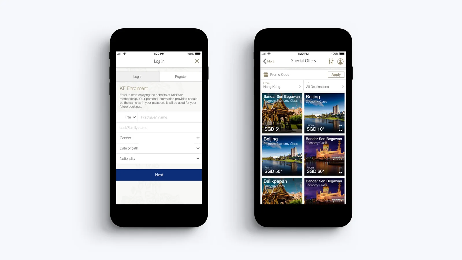
The study evaluated KrisFlyer login and registration, finding special offers and applying promo codes. Analytics had raised questions about registration abandonment. We wanted to understand how users progressed through the flow and where the interface made the task harder.
I conducted a remote, unmoderated usability study with six iPhone users through UserTesting. Lead UX Researcher Tara McQuillan reviewed the proposal. Participants lived in the US or UK and had recent experience using an airline app or mobile website. Sessions lasted around 20–30 minutes.
02 / 07
Follow the whole task
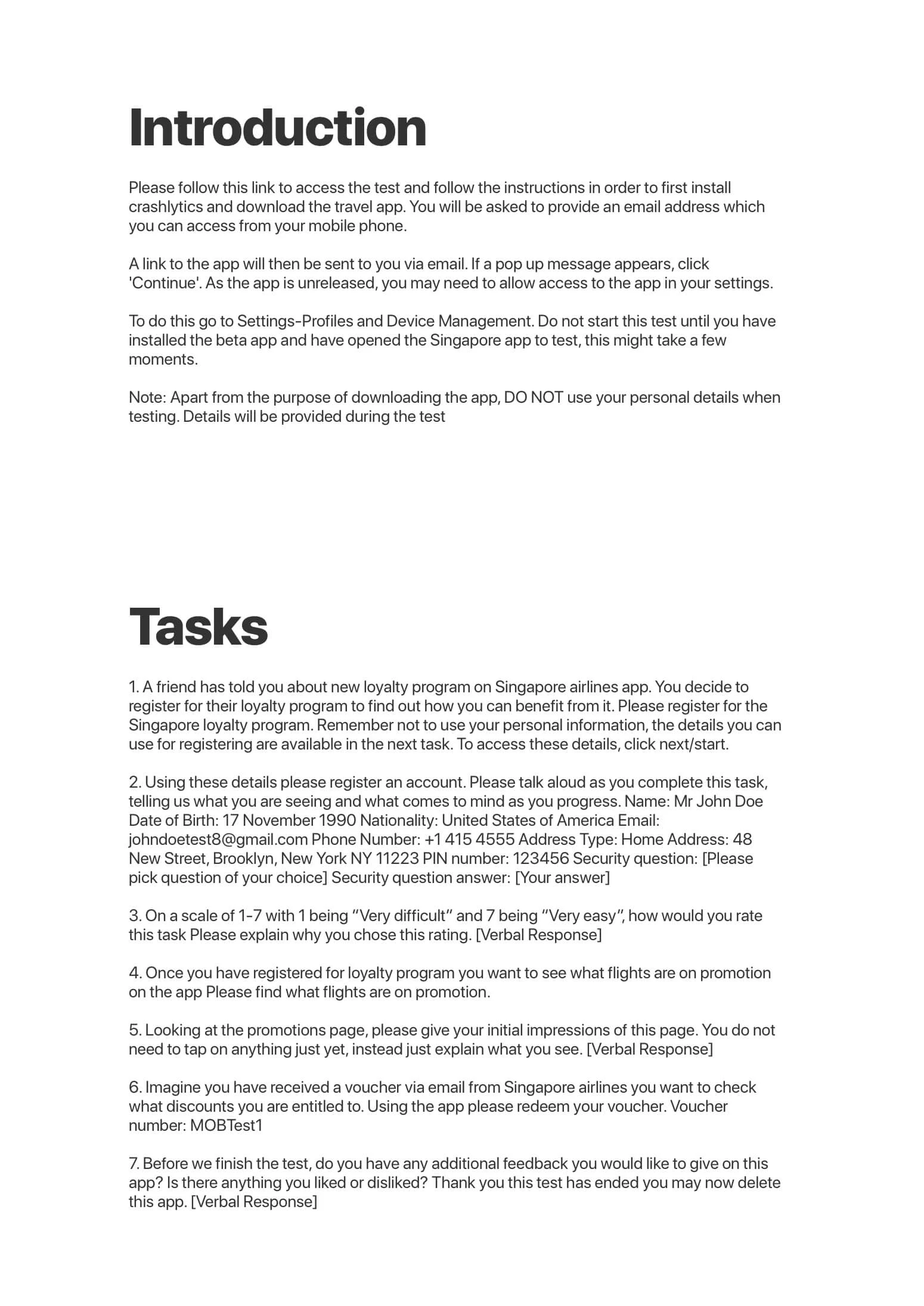
Participants installed a beta app and used supplied test details to register for the loyalty programme. They talked aloud as they worked, rated the ease of the task on a seven-point scale, found flights on promotion and redeemed a supplied voucher.
The tasks connected the initial setup to a reason for joining: discovering and using the benefits. That made it possible to assess both the form itself and the transition into the rest of the app.
03 / 07
Completion did not mean an easy experience
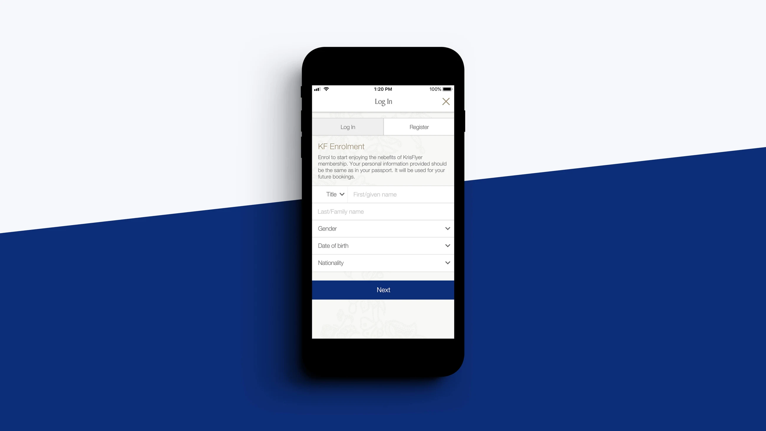
All six participants completed registration, but all experienced major difficulties with the native pickers and calendar. All six also complained about the amount of information required.
The date-of-birth picker was especially troublesome. Participants tried to enter information from left to right and were hindered by its validation logic. The recommendation was to remove that constraint so the interaction followed the order people expected.
04 / 07
Reduce unnecessary interpretation
Four of six participants struggled with the first- and last-name fields. Users initially entered both names in the first field and then corrected the mistake. One participant did not understand “Given name”.
The recommendations focused on simplifying the work: reduce required and optional fields, consider one full-name input, replace the separate phone-area input with a complete phone-number field and improve validation.
We also recommended fewer address lines. Where an address was not essential at registration, it could be optional; where it was required, the interface should explain the value of providing it, such as reusing it during flight booking.
05 / 07
Use search where long pickers slow people down
All participants expressed frustration at scrolling through long country lists. Half said they would rather type a city name than use the native city picker.
The recommendations reused a pattern already present in the app: a searchable modal similar to the airport picker. Focusing the search field and displaying the keyboard would make typing the obvious next step.
- Preload lists to improve perceived loading time.
- Use predictive search for location fields.
- Only show state or province when it applies to the selected country.
- Replace the city spinner with a free-text field.
06 / 07
Make offers easier to recognise
Five of six participants found the Special Offers page easily. One treated the home screen as the offers page and attempted the task there.
Of the five who reached the offers section, three used the More tab. Another used View All on the home screen, while one used the production app where More was the available route. The recommendation was consistent naming for the feature across entry points.
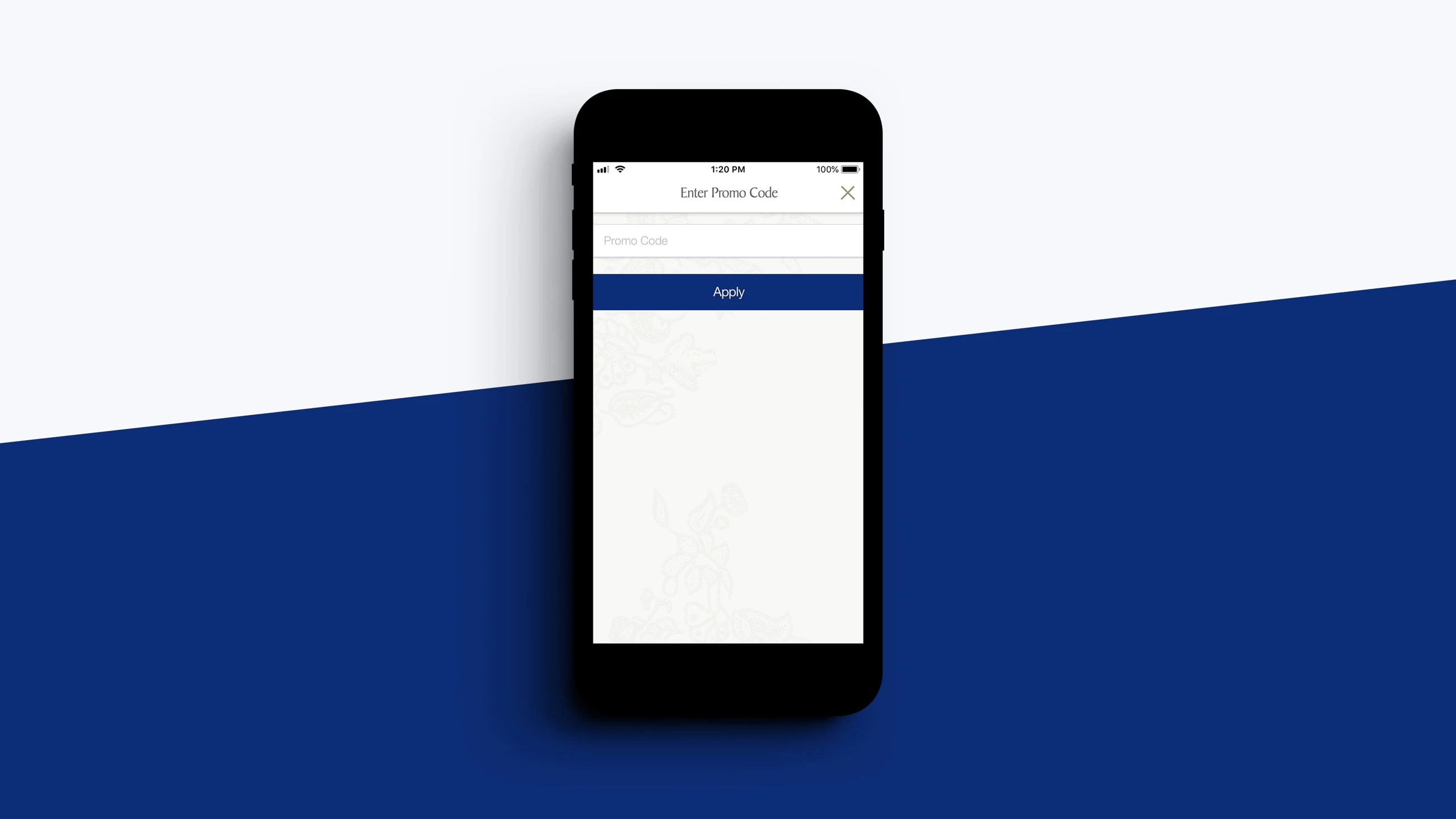
Most participants found and applied the promo code easily. One struggled to reach the offers page but recovered and completed the task. The findings point to navigation and naming as well as the redemption interaction itself.

07 / 07
What the study established
The study exposed specific interaction problems that completion rates alone would have concealed. The recommendations addressed form length, field language, picker behaviour and inconsistent entry points.
These are findings from six usability sessions and the resulting design recommendations. They are not evidence of a measured reduction in abandonment after launch.